Overview
Box plots (also called box-and-whisker plots) are graphical representations of data distributions that display five key statistical measures simultaneously: the minimum, first quartile (Q1), median (Q2), third quartile (Q3), and maximum. These visual tools provide an efficient way to understand the spread, center, and skewness of a dataset at a glance. On the GRE, gre box plots questions test your ability to extract statistical information from visual representations and compare multiple datasets quickly and accurately.
Understanding box plots is essential for the GRE Quantitative Reasoning section because they frequently appear in Data Analysis questions, which constitute approximately 15-20% of the quantitative section. The GRE uses box plots to assess your statistical literacy, your ability to interpret visual data, and your understanding of fundamental concepts like quartiles, range, and interquartile range. These questions often require you to make comparisons between datasets, identify outliers, or calculate specific statistical measures based on the visual information provided.
Box plots connect to broader Quantitative Reasoning concepts including measures of central tendency (mean, median, mode), measures of spread (range, interquartile range, standard deviation), and percentiles. They serve as a bridge between raw numerical data and statistical interpretation, making them a high-yield topic that integrates multiple statistical concepts into a single visual framework. Mastering box plots enhances your ability to work with other data visualization formats like histograms, frequency distributions, and scatter plots, all of which may appear on the GRE.
Learning Objectives
- [ ] Identify when Box plots is being tested
- [ ] Explain the core rule or strategy behind Box plots
- [ ] Apply Box plots to GRE-style questions accurately
- [ ] Construct a box plot from a given dataset or statistical summary
- [ ] Calculate the interquartile range (IQR) and identify potential outliers using box plot information
- [ ] Compare multiple datasets using side-by-side box plots and draw valid conclusions about their distributions
- [ ] Determine which statistical measures can and cannot be calculated from a box plot alone
Prerequisites
- Basic statistical measures: Understanding mean, median, and mode is essential because box plots display the median and relate to other measures of central tendency
- Percentiles and quartiles: Box plots are built on quartile values, so recognizing that Q1 represents the 25th percentile, Q2 the 50th percentile (median), and Q3 the 75th percentile is fundamental
- Range and spread concepts: Familiarity with how data spreads around central values helps interpret the width and whisker length of box plots
- Number line interpretation: Box plots are displayed on number lines, requiring comfort with scale reading and distance estimation
Why This Topic Matters
Box plots represent one of the most efficient ways to communicate statistical information in research, business analytics, healthcare, and social sciences. In real-world applications, professionals use box plots to compare salary distributions across departments, analyze test score variations between schools, evaluate quality control measurements in manufacturing, and assess patient outcomes across treatment groups. The ability to quickly interpret these visualizations is a valuable skill that extends far beyond standardized testing.
On the GRE, box plot questions appear in approximately 2-4 questions per test administration, making them a high-frequency topic within Data Analysis. These questions typically appear in two formats: Quantitative Comparison questions that ask you to compare statistical measures from one or more box plots, and Problem Solving questions that require you to calculate specific values or identify true statements about the data. The GRE particularly favors questions that test whether students can distinguish between what information is directly available from a box plot (median, quartiles, range) versus what cannot be determined (mean, standard deviation, individual data points).
Box plots commonly appear in passages describing survey results, experimental data, or comparative studies. The GRE often presents side-by-side box plots comparing two or more groups, testing your ability to make valid comparative statements about spread, center, and distribution shape. Understanding box plots also prepares you for questions involving other data representations, as the underlying statistical concepts transfer across visualization types.
Core Concepts
Anatomy of a Box Plot
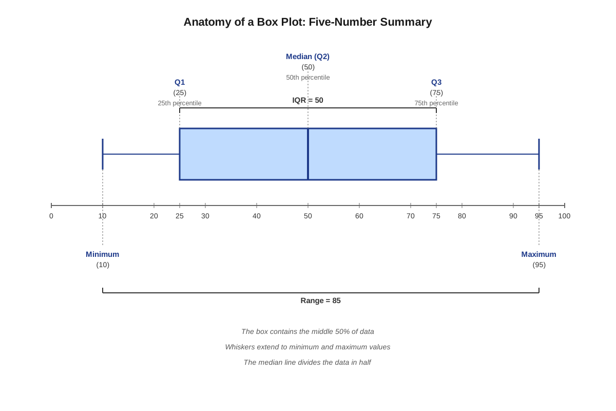
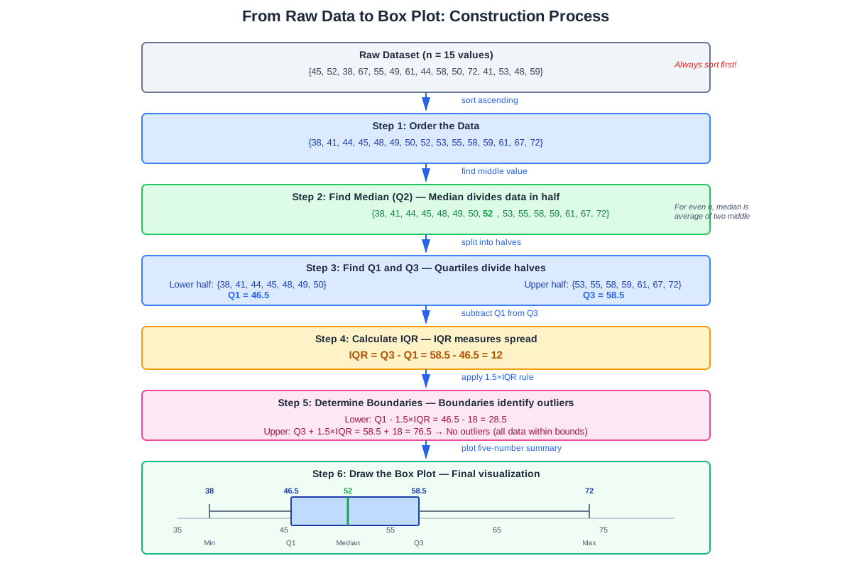
A box plot consists of five critical components that together summarize a dataset's distribution. The five-number summary includes:
- Minimum: The smallest value in the dataset (excluding outliers)
- First Quartile (Q1): The value below which 25% of the data falls
- Median (Q2): The middle value that divides the dataset in half
- Third Quartile (Q3): The value below which 75% of the data falls
- Maximum: The largest value in the dataset (excluding outliers)
The visual structure consists of a rectangular box with a line inside and two "whiskers" extending from the box. The left edge of the box represents Q1, the line inside the box represents the median, and the right edge represents Q3. The left whisker extends from Q1 to the minimum value, while the right whisker extends from Q3 to the maximum value. This configuration allows viewers to see both the central 50% of data (contained in the box) and the full range of the dataset.
The Interquartile Range (IQR)
The interquartile range (IQR) is calculated as Q3 - Q1 and represents the spread of the middle 50% of the data. This measure is crucial because it indicates data variability while being resistant to extreme values. A larger IQR indicates greater spread in the central portion of the data, while a smaller IQR suggests data points cluster more tightly around the median.
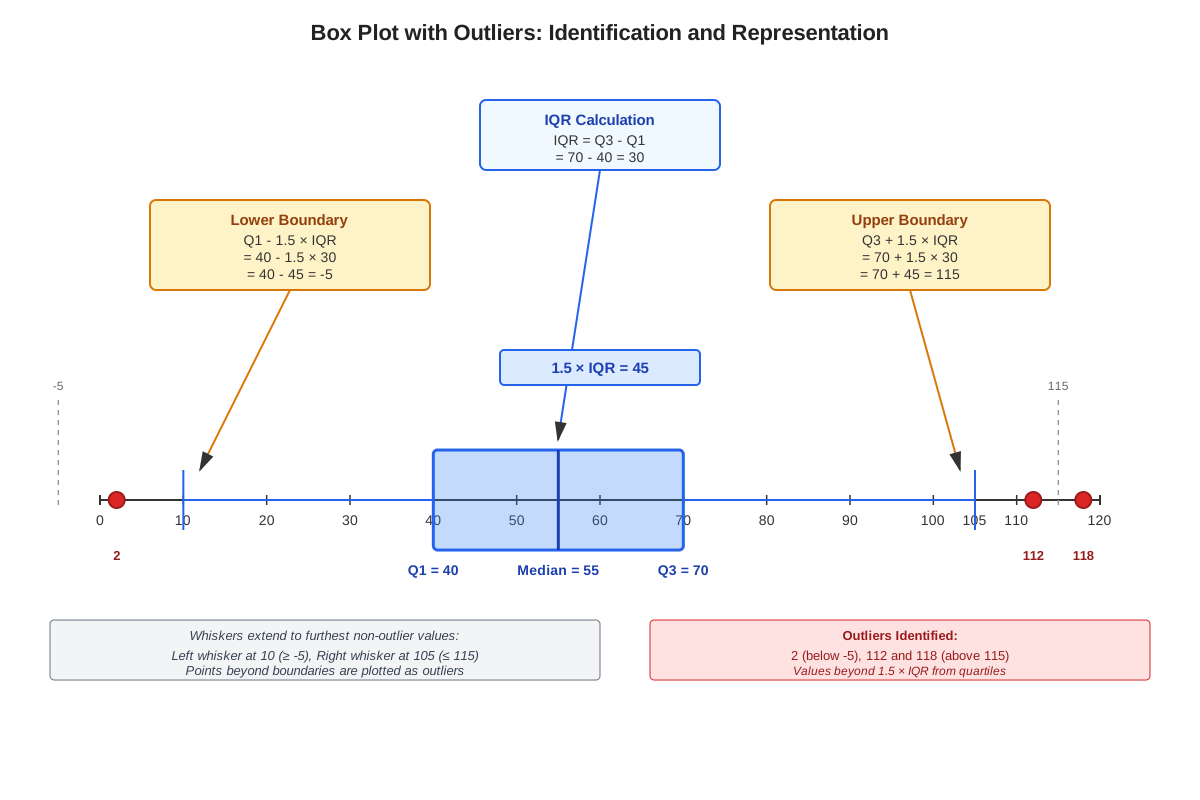
The IQR serves as the foundation for identifying outliers in box plots. The standard rule defines potential outliers as values that fall:
- Below Q1 - 1.5(IQR), or
- Above Q3 + 1.5(IQR)
When outliers exist, they are typically displayed as individual points beyond the whiskers, and the whiskers extend only to the most extreme non-outlier values rather than to the true minimum and maximum.
Reading Box Plot Information
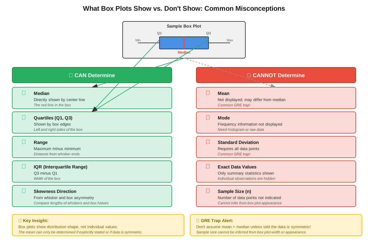
Box plots directly display certain statistical measures while leaving others indeterminable:
| Can Determine | Cannot Determine |
|---|---|
| Median (Q2) | Mean |
| Quartiles (Q1, Q3) | Standard deviation |
| Range (Max - Min) | Individual data values |
| Interquartile Range (IQR) | Exact number of data points |
| Relative spread | Mode |
| Skewness direction | Specific percentile values (other than 25th, 50th, 75th) |
This distinction is critical for GRE questions, which often test whether students incorrectly assume they can calculate the mean from a box plot. While the median is clearly marked, the mean requires knowledge of all individual values and their frequencies, information not provided by the box plot structure.
Interpreting Distribution Shape
Box plots reveal distribution characteristics through their visual symmetry and whisker lengths:
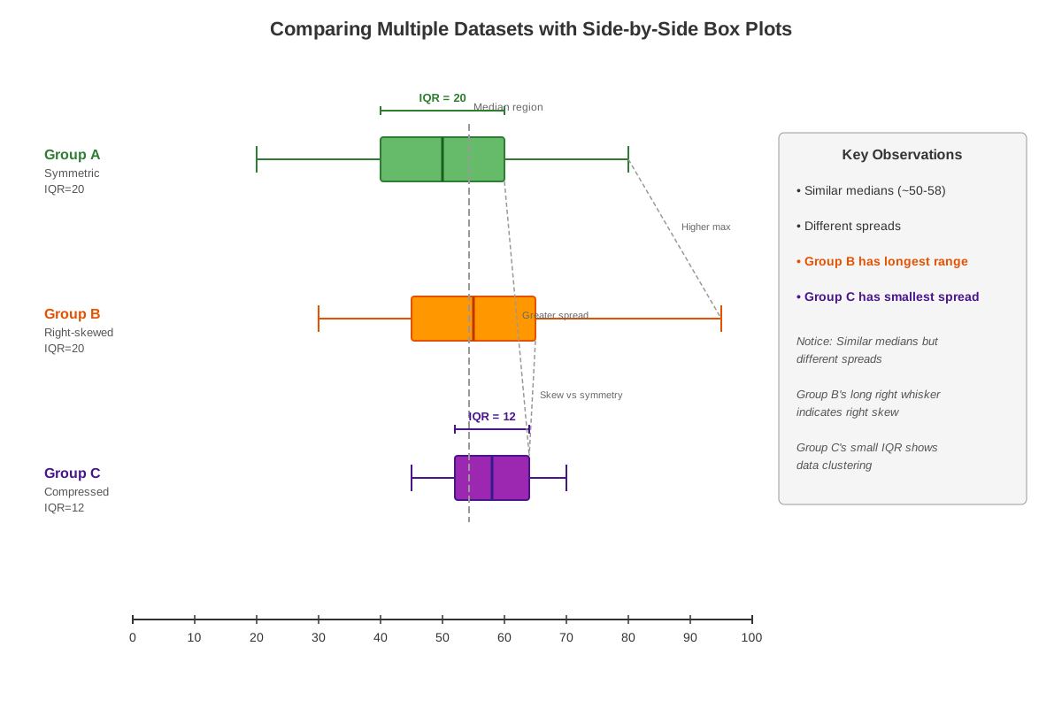
Symmetric distribution: The median line sits approximately in the center of the box, and both whiskers have similar lengths. This suggests data is evenly distributed around the median.
Right-skewed (positively skewed) distribution: The median line sits closer to Q1 (left side of box), and the right whisker is noticeably longer than the left whisker. This indicates a tail of higher values extending to the right.
Left-skewed (negatively skewed) distribution: The median line sits closer to Q3 (right side of box), and the left whisker is longer than the right whisker. This indicates a tail of lower values extending to the left.
Understanding skewness helps answer GRE questions about the relationship between mean and median. In right-skewed distributions, the mean exceeds the median because extreme high values pull the mean upward. In left-skewed distributions, the mean falls below the median.
Comparing Multiple Box Plots
The GRE frequently presents side-by-side box plots for comparison. When comparing distributions:
Center comparison: Compare the median positions. The dataset with the higher median has a higher central value, though this says nothing about means.
Spread comparison: Compare IQR values (box widths) and ranges (total whisker span). Wider boxes indicate greater variability in the central 50% of data.
Overlap assessment: Determine whether the boxes overlap. Non-overlapping boxes suggest distinctly different distributions, while substantial overlap indicates similarity.
Outlier comparison: Note which datasets contain outliers and in which direction, as this provides information about extreme values.
Calculating Values from Box Plots
Given a box plot, you can calculate:
- Range = Maximum - Minimum
- Interquartile Range (IQR) = Q3 - Q1
- Percentage of data in any quartile = Always 25% per quartile
- Percentage of data between any two quartile boundaries
For example, the percentage of data between Q1 and Q3 is always 50%, regardless of the actual values. The percentage of data below the median is always 50%, and above the median is always 50%.
Concept Relationships
The components of box plots build upon each other hierarchically. The five-number summary (minimum, Q1, median, Q3, maximum) → forms the foundation → which determines the IQR (Q3 - Q1) → which establishes outlier boundaries (Q1 - 1.5×IQR and Q3 + 1.5×IQR) → which affects whisker placement and point plotting.
Box plots connect to prerequisite knowledge of quartiles and percentiles, as each quartile represents a specific percentile (Q1 = 25th, Q2 = 50th, Q3 = 75th). This relationship extends to understanding that the box itself contains exactly 50% of all data points, divided equally by the median line.
The visual characteristics of box plots (symmetry, whisker length, box width) → reveal distribution shape → which predicts the relationship between mean and median → which connects to broader concepts of skewness and data distribution. This chain of reasoning frequently appears in GRE questions that ask about distribution characteristics.
Box plots also relate to other data visualization methods. Histograms show the same data with more granular detail about frequency within intervals, while box plots provide a more condensed summary. Both visualization types can reveal skewness, but box plots make quartile identification immediate while histograms require calculation.
High-Yield Facts
⭐ The median is always shown as a line inside the box, dividing the dataset into two equal halves (50% below, 50% above).
⭐ The box itself always contains exactly 50% of the data, from Q1 to Q3, regardless of the box's width.
⭐ The mean cannot be determined from a box plot alone; only the median is directly visible.
⭐ The IQR (Q3 - Q1) measures the spread of the middle 50% of data and is used to identify outliers.
⭐ In a right-skewed distribution, the right whisker is longer than the left, and the mean exceeds the median.
- The range equals the maximum minus the minimum and represents the total spread of data.
- Outliers are typically defined as values beyond Q1 - 1.5(IQR) or Q3 + 1.5(IQR).
- A symmetric box plot has the median near the center of the box and whiskers of approximately equal length.
- Each quartile section (minimum to Q1, Q1 to Q2, Q2 to Q3, Q3 to maximum) contains exactly 25% of the data points.
- The width of the box (IQR) indicates variability; wider boxes show greater spread in the central data.
- Box plots cannot show the mode, frequency of specific values, or the exact number of data points.
- When comparing box plots, non-overlapping IQRs suggest substantially different distributions.
Quick check — test yourself on Box plots so far.
Try Flashcards →Common Misconceptions
Misconception: The mean can be calculated or identified from a box plot. → Correction: Box plots display only the median (the line inside the box), not the mean. Calculating the mean requires knowing all individual data values and their frequencies, which box plots do not provide. The mean and median coincide only in perfectly symmetric distributions.
Misconception: The width of the box indicates the number of data points. → Correction: The box width represents the IQR (Q3 - Q1), which measures the spread of values, not the count of data points. A dataset with 20 points could have the same IQR as a dataset with 200 points if their spreads are identical.
Misconception: Longer whiskers always indicate outliers. → Correction: Whisker length indicates the range of non-outlier data. Long whiskers simply mean the minimum and maximum values are far from the quartiles, which is normal in datasets with large ranges. Outliers are shown as separate points beyond the whiskers, not as part of the whiskers themselves.
Misconception: A box plot shifted higher on the number line indicates greater variability. → Correction: Position on the number line indicates the center (median) of the data, not its spread. Variability is shown by the IQR (box width) and range (total span). A dataset centered at 100 with IQR of 5 has less variability than a dataset centered at 50 with IQR of 20.
Misconception: The median line should always be in the exact center of the box. → Correction: The median's position within the box reveals distribution shape. When the median sits closer to Q1, the distribution is right-skewed; when closer to Q3, it's left-skewed. Only symmetric distributions have the median near the box's center.
Misconception: Box plots show all the data points in a dataset. → Correction: Box plots summarize data using five key values and show only outliers as individual points. The actual data points within each quartile are not displayed, making box plots a summary visualization rather than a complete data display.
Worked Examples
Example 1: Interpreting and Comparing Box Plots
Question: Two box plots display test scores for Class A and Class B. Class A has Q1 = 65, Median = 75, Q3 = 85, Min = 50, Max = 95. Class B has Q1 = 70, Median = 72, Q3 = 80, Min = 65, Max = 100. Which statement is true?
(A) Class A has a higher median and greater variability in the middle 50% of scores
(B) Class B has a higher median and greater variability in the middle 50% of scores
(C) Class A has a higher median and less variability in the middle 50% of scores
(D) Both classes have the same median
(E) The mean score for Class A is definitely higher than Class B
Solution:
Step 1: Compare medians.
- Class A median = 75
- Class B median = 72
- Class A has a higher median. This eliminates options (B) and (D).
Step 2: Calculate IQR for each class to assess variability in the middle 50%.
- Class A: IQR = Q3 - Q1 = 85 - 65 = 20
- Class B: IQR = Q3 - Q1 = 80 - 70 = 10
Step 3: Compare variability.
- Class A has IQR of 20, indicating greater spread in the middle 50%
- Class B has IQR of 10, indicating less spread in the middle 50%
- Class A has greater variability. This confirms option (A).
Step 4: Evaluate option (E).
- Box plots show medians, not means
- We cannot determine which class has a higher mean without knowing all individual scores
- Option (E) is incorrect because means cannot be determined from box plots alone
Answer: (A) Class A has a higher median (75 vs. 72) and greater variability in the middle 50% of scores (IQR of 20 vs. 10).
This example demonstrates the learning objectives of identifying what information box plots provide (median, IQR) versus what they don't (mean), and applying box plot interpretation to make valid comparisons.
Example 2: Calculating Outlier Boundaries
Question: A dataset has the following five-number summary: Min = 12, Q1 = 20, Median = 28, Q3 = 35, Max = 58. Using the standard outlier definition, determine whether the maximum value is an outlier.
Solution:
Step 1: Calculate the IQR.
- IQR = Q3 - Q1 = 35 - 20 = 15
Step 2: Determine the upper outlier boundary.
- Upper boundary = Q3 + 1.5(IQR)
- Upper boundary = 35 + 1.5(15)
- Upper boundary = 35 + 22.5 = 57.5
Step 3: Compare the maximum value to the upper boundary.
- Maximum value = 58
- Upper boundary = 57.5
- Since 58 > 57.5, the maximum value exceeds the upper boundary
Step 4: Determine outlier status.
- Any value above 57.5 is considered an outlier
- The maximum value of 58 is an outlier
Step 5: Consider how this affects the box plot.
- The whisker would extend to the largest non-outlier value (some value ≤ 57.5)
- The value 58 would be plotted as a separate point beyond the whisker
Answer: Yes, the maximum value of 58 is an outlier because it exceeds Q3 + 1.5(IQR) = 57.5.
This example applies the core strategy of using the IQR to identify outliers, a common GRE box plot question type that tests understanding of the 1.5×IQR rule.
Exam Strategy
When approaching GRE box plot questions, follow this systematic process:
Step 1: Identify what the question asks for. Determine whether you need to find a specific value (median, range, IQR), make a comparison between datasets, or identify true/false statements about the distribution.
Step 2: Extract the five-number summary. Quickly identify the minimum, Q1, median, Q3, and maximum from the visual. Write these down if the question is complex.
Step 3: Calculate derived values if needed. Compute IQR (Q3 - Q1) or range (Max - Min) only if the question requires these measures.
Step 4: Watch for trap answers involving the mean. If an answer choice mentions the mean or average, be immediately suspicious. Remember that means cannot be determined from box plots alone unless additional information is provided.
Exam Tip: When you see "average" or "mean" in an answer choice for a box plot question, it's usually a distractor unless the question explicitly states the mean or provides additional data.
Trigger words and phrases to watch for:
- "Middle 50% of the data" → refers to the IQR (the box)
- "Central tendency" → could refer to median (visible) or mean (not visible)
- "Spread" or "variability" → look at IQR and range
- "Skewed" → examine whisker lengths and median position within the box
- "Outlier" → calculate Q1 - 1.5(IQR) and Q3 + 1.5(IQR)
- "Compare the distributions" → look at medians, IQRs, and ranges
Process-of-elimination tips:
- Eliminate any answer that claims to know the mean without additional information
- Eliminate answers that confuse position (center) with spread (variability)
- Eliminate answers that claim to know the exact number of data points
- Eliminate answers that claim to identify the mode from a box plot
Time allocation advice:
Box plot questions typically require 1.5-2 minutes. Spend 20-30 seconds reading and understanding the plot, 30-60 seconds performing calculations, and 30-45 seconds evaluating answer choices. If a question requires comparing multiple box plots, allocate an additional 30 seconds for systematic comparison.
Memory Techniques
MNEMONIC for the five-number summary: "My Quarterback Might Quit Monday"
- Minimum
- Q1 (First Quartile)
- Median (Q2)
- Q3 (Third Quartile)
- Maximum
VISUALIZATION strategy: Picture a box plot as a "data sandwich":
- The bread slices are the minimum and maximum (the outer boundaries)
- The box is the "filling" containing the middle 50% of data
- The median line is the "center cut" dividing the sandwich in half
- The whiskers are the "toothpicks" holding everything together
ACRONYM for what you CAN'T determine: "MISFITS"
- Mean
- Individual data points
- Standard deviation
- Frequency of specific values
- Individual count (exact number of data points)
- Total sum of values
- Specific percentiles (beyond 25th, 50th, 75th)
1.5 IQR Rule memory aid: Think "One and a Half Times Out" - values that fall one and a half IQRs outside the box (beyond Q1 or Q3) are outliers.
Skewness memory technique:
- Right-skewed = Right whisker longer = Mean Right of median (higher)
- Left-skewed = Left whisker longer = Mean Left of median (lower)
Summary
Box plots are essential data visualization tools that display the five-number summary (minimum, Q1, median, Q3, maximum) in a compact graphical format. The rectangular box represents the interquartile range (IQR = Q3 - Q1), containing the middle 50% of data, while whiskers extend to the minimum and maximum non-outlier values. The median line inside the box divides the dataset in half. On the GRE, box plot questions test your ability to extract visible information (median, quartiles, range, IQR) while recognizing what cannot be determined (mean, standard deviation, individual values). Understanding distribution shape through whisker length and median position helps identify skewness. The 1.5×IQR rule identifies outliers as values beyond Q1 - 1.5(IQR) or Q3 + 1.5(IQR). Successful box plot interpretation requires distinguishing between measures of center (median) and spread (IQR, range), comparing multiple distributions systematically, and avoiding common traps about means and data counts.
Key Takeaways
- Box plots display five key values: minimum, Q1, median, Q3, and maximum, with the box containing exactly 50% of the data
- The median (line inside the box) is directly visible, but the mean cannot be determined from a box plot alone
- The IQR (Q3 - Q1) measures spread in the middle 50% of data and is used to identify outliers using the 1.5×IQR rule
- Distribution shape is revealed by whisker length and median position: symmetric distributions have centered medians and equal whiskers, while skewed distributions show asymmetry
- When comparing box plots, examine medians for center, IQR for variability, and overall range for total spread
- Common GRE traps include answer choices that reference means, assume you can count data points, or confuse position with spread
- Each quartile section always contains exactly 25% of the data, regardless of the visual width or length
Related Topics
Histograms and Frequency Distributions: These provide more detailed views of data distribution by showing frequencies within specific intervals, complementing the summary nature of box plots. Mastering box plots builds the foundation for interpreting histograms.
Standard Deviation and Variance: While box plots show spread through IQR, standard deviation provides a different measure of variability. Understanding both helps you choose appropriate measures for different data characteristics.
Percentiles and Quartiles: Box plots are built on quartile values, so deeper study of percentile calculations and interpretations extends your ability to work with ranked data.
Scatter Plots and Correlation: These visualizations show relationships between two variables, while box plots show distribution of a single variable. Together, they form a comprehensive toolkit for data analysis questions.
Normal Distribution: Understanding how box plots represent normally distributed data (symmetric with equal whiskers) versus skewed data connects visual interpretation to theoretical distributions.
Practice CTA
Now that you've mastered the fundamentals of box plots, it's time to solidify your understanding through practice. Attempt the practice questions to test your ability to extract information from box plots, identify outliers, compare distributions, and avoid common traps. Use the flashcards to reinforce the five-number summary, IQR calculations, and the distinction between what box plots can and cannot reveal. Remember, box plots appear frequently on the GRE, and confident interpretation of these visualizations can quickly earn you valuable points. Your investment in understanding this high-yield topic will pay dividends on test day!
Sign up free to keep reading
Create a free AnvayaPrep account to finish this GRE guide on Box plots — plus flashcards and practice questions.