Overview
Scatterplots are graphical representations that display the relationship between two quantitative variables by plotting individual data points on a coordinate plane. Each point represents a single observation, with its position determined by the values of two variables—one plotted on the horizontal (x) axis and the other on the vertical (y) axis. On the GRE, scatterplots appear frequently in the Data Analysis and Interpretation questions, testing students' ability to extract information, identify patterns, and draw conclusions from visual data representations.
Understanding GRE scatterplots is essential because these questions assess multiple skills simultaneously: reading graphs accurately, recognizing correlation patterns, estimating values, and making logical inferences about data relationships. The GRE often presents scatterplots alongside other data representations or embeds them within multi-part questions that require synthesizing information from multiple sources. Mastery of scatterplots directly impacts performance on approximately 10-15% of Quantitative Reasoning questions, making this a high-yield topic for test preparation.
Within the broader context of Quantitative Reasoning, scatterplots connect to fundamental concepts including coordinate geometry, linear relationships, statistical measures, and data interpretation. They serve as visual tools that bridge algebraic concepts (such as slope and linear equations) with statistical reasoning (such as correlation and trend analysis). Strong scatterplot skills enhance performance not only on direct graph-reading questions but also on problems involving functions, sequences, and comparative data analysis across the GRE.
Learning Objectives
- [ ] Identify when Scatterplots is being tested
- [ ] Explain the core rule or strategy behind Scatterplots
- [ ] Apply Scatterplots to GRE-style questions accurately
- [ ] Determine the type and strength of correlation from visual inspection of scatterplot patterns
- [ ] Estimate values and make predictions based on scatterplot trends
- [ ] Distinguish between correlation and causation in scatterplot interpretations
- [ ] Identify outliers and assess their impact on data relationships
Prerequisites
- Coordinate plane fundamentals: Understanding x and y axes, quadrants, and point plotting is essential for reading any scatterplot accurately
- Basic statistics concepts: Familiarity with mean, median, and range helps interpret data distribution and central tendencies shown in scatterplots
- Linear equations and slope: Recognizing positive and negative slopes enables identification of correlation direction and strength
- Graph reading skills: General ability to extract numerical information from visual representations forms the foundation for scatterplot analysis
Why This Topic Matters
Scatterplots represent one of the most practical data visualization tools used across scientific research, business analytics, economics, and social sciences. In real-world applications, professionals use scatterplots to identify relationships between variables such as advertising spending and sales revenue, study time and test scores, or temperature and energy consumption. The ability to interpret these relationships quickly and accurately is a fundamental analytical skill valued in graduate-level academic work and professional settings.
On the GRE, scatterplot questions appear in approximately 2-4 questions per test, typically within the Data Interpretation sets that comprise 15-20% of the Quantitative Reasoning section. These questions frequently appear as part of multi-question sets where a single scatterplot serves as the basis for 2-3 related questions. The test makers favor scatterplots because they efficiently assess multiple competencies: numerical estimation, pattern recognition, logical reasoning, and the ability to distinguish between correlation and causation—all critical skills for graduate-level study.
Common GRE question formats include: identifying the number of data points meeting specific criteria, estimating the difference between actual and predicted values, determining which statements about correlation are supported by the data, comparing values across different regions of the plot, and identifying outliers or unusual data points. Questions may also combine scatterplots with tables, bar graphs, or text descriptions, requiring integration of information from multiple sources.
Core Concepts
Structure and Components of Scatterplots
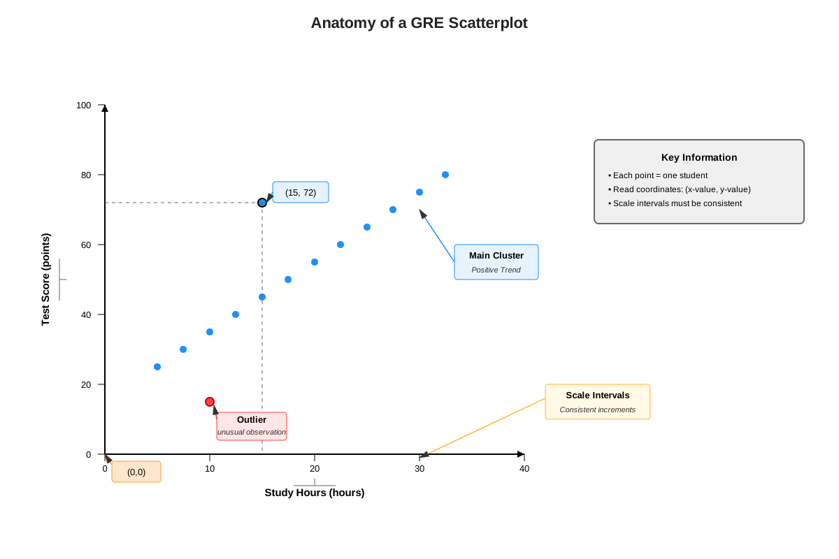
A scatterplot consists of several key elements that must be identified and understood before attempting to answer any questions. The horizontal axis (x-axis) represents the independent variable—the variable that is manipulated or considered as the predictor. The vertical axis (y-axis) represents the dependent variable—the variable that responds to or is predicted by the independent variable. Each plotted point represents a single observation or data pair, with coordinates (x, y) corresponding to the values of both variables for that observation.
The scale of each axis determines how values are represented spatially. GRE scatterplots may use different scales on each axis, and these scales may not begin at zero. Careful attention to axis labels, tick marks, and numerical intervals is critical for accurate value estimation. The title and axis labels provide context about what variables are being measured and their units, which is essential for interpreting the meaning of patterns observed in the data.
Types of Correlation Patterns
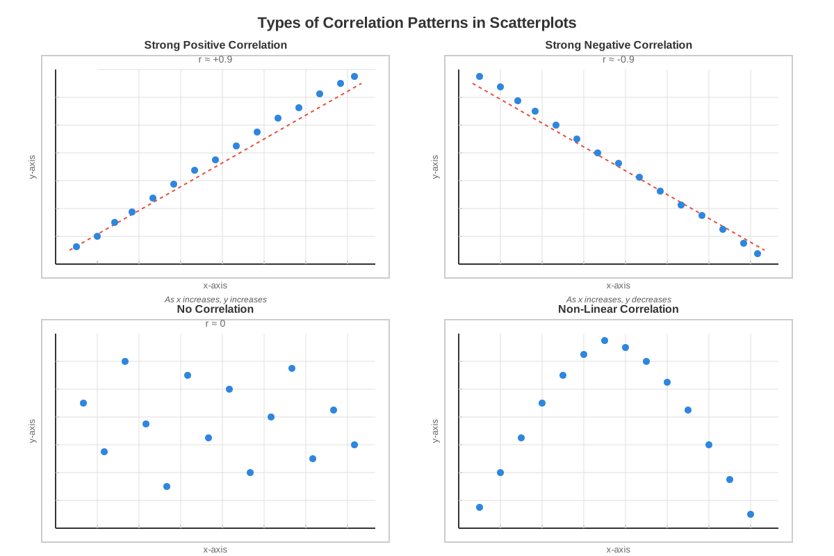
Positive correlation occurs when both variables tend to increase together—as x-values increase, y-values also tend to increase. Visually, this appears as a pattern of points trending upward from left to right. The strength of positive correlation ranges from weak (points widely scattered around an upward trend) to strong (points closely clustered along an upward-sloping line). On the GRE, recognizing positive correlation helps answer questions about whether increases in one variable are associated with increases in another.
Negative correlation (also called inverse correlation) occurs when one variable tends to decrease as the other increases. This pattern appears as points trending downward from left to right. Like positive correlation, negative correlation varies in strength based on how tightly points cluster around the downward trend. Strong negative correlation indicates a reliable inverse relationship, while weak negative correlation shows only a slight tendency for variables to move in opposite directions.
No correlation (zero correlation) exists when there is no apparent linear relationship between the variables. Points appear randomly scattered across the plot with no discernible upward or downward trend. This pattern indicates that knowing the value of one variable provides no information about the likely value of the other variable. On the GRE, questions may ask students to identify which pair of variables shows no correlation or to recognize when correlation is absent.
Correlation Strength and Linearity
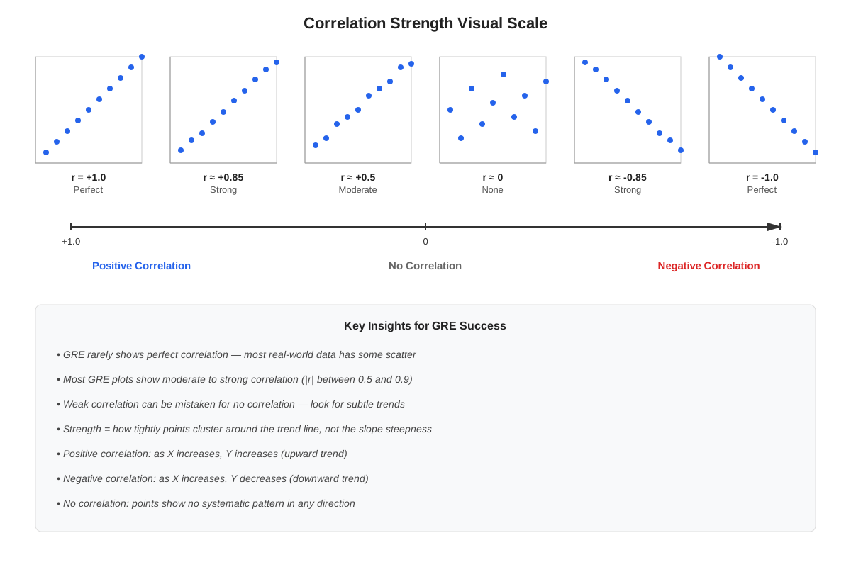
The strength of correlation is determined by how closely data points cluster around an imaginary trend line. Strong correlation means points lie very close to a straight line, while weak correlation means points are widely dispersed. The GRE tests the ability to visually assess correlation strength by asking comparative questions such as "Which scatterplot shows the strongest correlation?" or "Is the correlation between variables A and B stronger or weaker than the correlation between variables C and D?"
Linear relationships appear when the pattern of points approximates a straight line. Most GRE scatterplot questions focus on linear relationships because they are easier to interpret and more commonly tested. However, some advanced questions may present nonlinear relationships where the pattern curves rather than following a straight line. Recognizing whether a relationship is linear or nonlinear affects predictions and interpretations about the data.
The correlation coefficient (r) is a numerical measure of correlation strength and direction, ranging from -1 to +1. While the GRE rarely asks students to calculate correlation coefficients, understanding that values near +1 indicate strong positive correlation, values near -1 indicate strong negative correlation, and values near 0 indicate no correlation helps interpret verbal descriptions of correlation in answer choices.
Outliers and Data Anomalies
An outlier is a data point that falls far from the general pattern established by other points. Outliers may result from measurement errors, unusual circumstances, or genuine extreme values. On scatterplots, outliers appear as isolated points separated from the main cluster. The GRE frequently tests the ability to identify outliers and understand their potential impact on data interpretation.
Outliers can significantly affect statistical measures and trend lines, particularly in small datasets. A single extreme outlier can make a weak correlation appear stronger or a strong correlation appear weaker. GRE questions may ask students to identify which point is an outlier, determine how many outliers exist, or assess whether removing an outlier would strengthen or weaken an apparent correlation.
Estimation and Prediction
Value estimation from scatterplots requires careful attention to axis scales and point positions. The GRE tests estimation skills by asking for approximate values of specific data points, differences between points, or the number of points falling within certain ranges. Effective estimation involves identifying the nearest gridlines or tick marks and interpolating between them proportionally.
Trend-based prediction involves extending the pattern observed in existing data to estimate values beyond the plotted range. If a scatterplot shows a clear linear trend, students may be asked to predict the approximate y-value for an x-value not shown in the data, or vice versa. This requires mentally extending the trend line and estimating where a new point would fall. However, the GRE also tests understanding that predictions become less reliable as they extend further from the observed data range.
Correlation versus Causation
A critical concept repeatedly tested on the GRE is the distinction between correlation and causation. Correlation means two variables are statistically related—they tend to change together in a predictable pattern. Causation means one variable directly causes changes in the other. The fundamental principle is that correlation does not imply causation—just because two variables are correlated does not mean one causes the other.
Three possible explanations exist for observed correlation: (1) variable X causes variable Y, (2) variable Y causes variable X, or (3) a third variable causes both X and Y, creating a spurious correlation. The GRE tests this concept by presenting answer choices that incorrectly infer causation from correlation or by asking students to identify which statement is supported by the data (correlation) versus which makes an unsupported causal claim.
Concept Relationships
The concepts within scatterplot analysis form an interconnected framework where each element builds upon others. The fundamental structure (axes, scales, points) → enables pattern recognition (positive/negative/no correlation) → which leads to strength assessment (strong/weak correlation) → supporting estimation and prediction → while requiring careful distinction between correlation and causation. Outlier identification intersects with all these concepts, as outliers affect pattern recognition, strength assessment, and prediction accuracy.
Scatterplots connect to prerequisite knowledge of coordinate geometry by applying the same x-y coordinate system used in plotting points and graphing functions. The concept of slope from linear equations directly relates to correlation direction—positive slopes correspond to positive correlation, negative slopes to negative correlation. Statistical prerequisites including mean and range help contextualize data distribution patterns visible in scatterplots.
Within the broader Data Analysis unit, scatterplots relate to other graphical representations (bar graphs, line graphs, pie charts) as alternative ways to visualize data relationships. They connect to probability and statistics through concepts of distribution, central tendency, and variability. Understanding scatterplots also enhances performance on word problems involving relationships between variables, as the visual representation helps conceptualize abstract relationships.
High-Yield Facts
- ⭐ Each point on a scatterplot represents one observation with two variable values (x, y)
- ⭐ Positive correlation appears as an upward trend from left to right; negative correlation appears as a downward trend
- ⭐ Correlation strength is determined by how tightly points cluster around a trend line, not by the steepness of the trend
- ⭐ Correlation does not imply causation—two variables can be strongly correlated without one causing the other
- ⭐ Outliers are points that fall far from the general pattern and can significantly affect correlation interpretation
- The independent variable is conventionally plotted on the x-axis, while the dependent variable appears on the y-axis
- Zero correlation means no linear relationship exists between variables, appearing as randomly scattered points
- Strong correlation (positive or negative) means points lie close to a straight line pattern
- Axis scales may differ and may not start at zero, requiring careful attention to labels and intervals
- Predictions based on extending trends beyond the observed data range become increasingly unreliable
- Multiple data points may overlap at the same location, potentially appearing as a single point
- The steepness of a trend relates to the rate of change but not necessarily to correlation strength
- Nonlinear relationships may show strong associations that don't follow a straight-line pattern
- Scatterplots can reveal clusters, gaps, or other patterns beyond simple linear correlation
Quick check — test yourself on Scatterplots so far.
Try Flashcards →Common Misconceptions
Misconception: A steeper trend line indicates stronger correlation → Correction: Correlation strength depends on how closely points cluster around the trend line, not the steepness (slope) of that line. A steep line with widely scattered points shows weaker correlation than a gentle slope with tightly clustered points.
Misconception: If two variables are correlated, one must cause the other → Correction: Correlation indicates association but not causation. Both variables might be caused by a third factor, or the correlation might be coincidental. The GRE specifically tests the ability to distinguish correlation from causation.
Misconception: All points must fall exactly on a line for correlation to exist → Correction: Perfect correlation (all points on a line) is extremely rare in real data. Strong correlation exists when points cluster closely around a trend line, even if no points fall exactly on it.
Misconception: No correlation means the variables are completely unrelated → Correction: No linear correlation means no straight-line relationship exists, but variables might still have a nonlinear relationship (curved pattern) or other complex association not captured by linear correlation.
Misconception: Outliers should always be ignored when interpreting scatterplots → Correction: Outliers contain important information and should be identified and considered. They may represent measurement errors, unusual cases, or genuine extreme values. The GRE often asks specifically about outliers and their effects.
Misconception: The x-axis always represents time → Correction: While time series often use the x-axis for time, scatterplots can display any two quantitative variables. The x-axis represents the independent variable, which may or may not be time-related.
Misconception: More data points always mean stronger correlation → Correction: The number of data points affects statistical reliability but not correlation strength. A small dataset can show strong correlation if points cluster tightly, while a large dataset can show weak correlation if points are widely scattered.
Worked Examples
Example 1: Identifying Correlation and Estimating Values
Question: A scatterplot displays the relationship between hours studied (x-axis, ranging from 0 to 20) and test scores (y-axis, ranging from 50 to 100). The plot shows 15 data points. Most points cluster along an upward trend from approximately (2, 60) to (18, 95), with one point at (15, 65).
(a) What type of correlation does the scatterplot show?
(b) Identify the outlier and explain why it's an outlier.
(c) Approximately how many students studied between 10 and 15 hours?
Solution:
(a) The scatterplot shows positive correlation. The upward trend from left to right indicates that as hours studied increases, test scores tend to increase. The clustering of most points along this trend suggests the correlation is moderately strong, though not perfect since points don't fall exactly on a line.
Reasoning: This addresses the learning objective of identifying correlation type from visual patterns. The upward trend is the key indicator of positive correlation.
(b) The point at (15, 65) is an outlier. While most students who studied 15 hours scored in the 85-90 range (based on the trend), this student scored only 65, which is approximately 20-25 points below the expected value. This point falls far from the general pattern established by other data points.
Reasoning: Outliers are identified by their distance from the main cluster or trend. This point represents unusual performance—high study time but low score—making it anomalous.
(c) To estimate this, examine the x-axis region between 10 and 15 hours. Counting points whose x-coordinates fall in this range, approximately 4-5 students studied between 10 and 15 hours (including the outlier at x = 15).
Reasoning: This tests value estimation skills. Students must visually identify which points fall within the specified x-range, demonstrating careful graph reading and counting abilities.
Example 2: Comparing Correlations and Making Predictions
Question: Two scatterplots are shown. Plot A displays the relationship between advertising spending (thousands of dollars) and sales revenue (thousands of dollars) for 20 products, with points clustered tightly along an upward trend from (5, 30) to (50, 200). Plot B displays the relationship between product weight (pounds) and sales revenue for the same products, with points scattered randomly across the graph with no apparent pattern.
(a) Which plot shows stronger correlation?
(b) For Plot A, if a company spends $35,000 on advertising, what approximate sales revenue would you predict?
(c) Can you conclude that increased advertising spending causes increased sales revenue?
Solution:
(a) Plot A shows stronger correlation (in fact, Plot B shows essentially no correlation). The tight clustering of points along an upward trend in Plot A indicates strong positive correlation, while the random scatter in Plot B indicates zero correlation between product weight and sales revenue.
Reasoning: This directly tests the ability to compare correlation strength across different scatterplots—a common GRE question format. Tight clustering indicates strong correlation; random scatter indicates no correlation.
(b) To predict sales revenue for $35,000 advertising spending, locate x = 35 on Plot A's x-axis and estimate the y-value of the trend line at that point. Given the trend from (5, 30) to (50, 200), the approximate slope is (200-30)/(50-5) = 170/45 ≈ 3.78. Using the point-slope relationship: y ≈ 30 + 3.78(35-5) ≈ 30 + 113 ≈ $143,000.
Alternatively, visual estimation: 35 is about 2/3 of the way from 5 to 50, so the predicted y-value should be about 2/3 of the way from 30 to 200, which is approximately 30 + (2/3)(170) ≈ 30 + 113 ≈ $143,000.
Reasoning: This tests prediction skills based on trend extension. Multiple approaches (calculation or visual proportion) can yield the same estimate.
(c) No, you cannot conclude causation from correlation alone. While Plot A shows strong positive correlation between advertising spending and sales revenue, this correlation doesn't prove that advertising causes increased sales. Alternative explanations include: (1) companies with higher sales revenue can afford more advertising, (2) both variables might be driven by a third factor such as product quality or market demand, or (3) the relationship might be coincidental. The scatterplot only demonstrates association, not causation.
Reasoning: This addresses the critical learning objective of distinguishing correlation from causation—one of the most important concepts tested on GRE scatterplot questions.
Exam Strategy
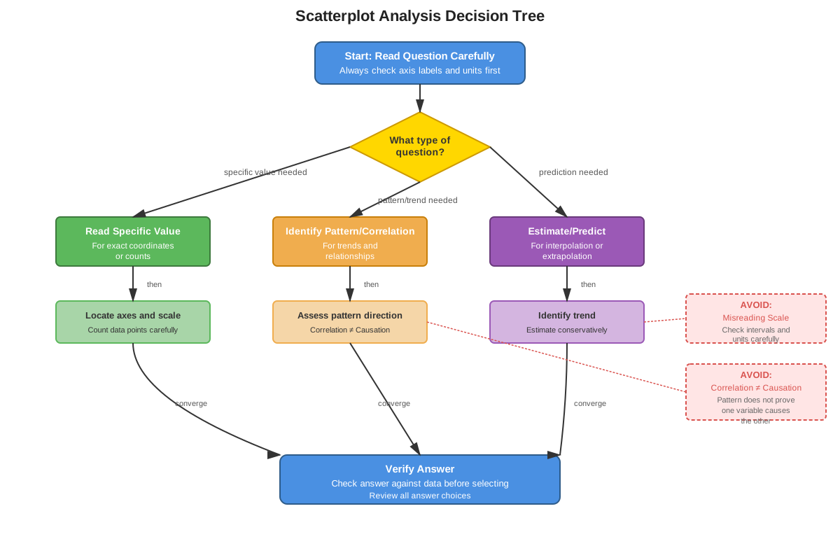
When approaching GRE scatterplot questions, begin by systematically examining the graph structure before reading the question. Identify and note: (1) what each axis represents and its scale, (2) the range of values on each axis, (3) the general pattern or trend of the data, and (4) any obvious outliers or unusual features. This 10-15 second investment prevents errors caused by misreading scales or overlooking important features.
Trigger words and phrases that indicate scatterplot questions include: "correlation between," "relationship between," "as X increases," "trend," "outlier," "data point," "approximately how many," and "based on the scatterplot." Questions asking about "causation" or "proves that" are often testing the correlation-versus-causation distinction—be especially careful with these.
For estimation questions, use the gridlines strategically. Identify the nearest gridlines to the point of interest and estimate proportionally between them. If a point falls about 1/4 of the way between gridlines at 20 and 40, estimate its value as approximately 25. When counting points meeting certain criteria, systematically scan the relevant region to avoid missing or double-counting points.
For correlation questions, focus on the overall pattern rather than individual points. Ask: "Do points generally trend upward (positive), downward (negative), or show no pattern (zero correlation)?" Then assess strength: "Are points tightly clustered (strong) or widely scattered (weak)?" Don't be distracted by one or two outliers when determining the overall correlation pattern.
Time allocation: Spend approximately 1-2 minutes per scatterplot question. If a scatterplot serves as the basis for multiple questions (common in Data Interpretation sets), invest slightly more time (30-45 seconds) in the initial graph analysis, then answer each subsequent question more quickly using that foundation. If a question requires extensive calculation or very precise estimation, consider whether an approximate answer would suffice or whether the question is worth skipping and returning to later.
Process of elimination works particularly well for scatterplot questions. Eliminate answer choices that: (1) misstate the correlation direction (positive vs. negative), (2) claim causation when only correlation is shown, (3) provide values clearly outside the range shown on the graph, (4) contradict the overall trend based on one outlier, or (5) make absolute statements ("all," "none," "always") that aren't supported by the data.
Memory Techniques
PNZS - Remember correlation types: Positive (upward trend), Negative (downward trend), Zero (no trend), Strength (tight vs. scattered). This acronym helps systematically evaluate any scatterplot.
"Cluster = Correlation" - The tighter the cluster around a trend line, the stronger the correlation. Visualize points being pulled together by a magnet along the trend line—strong magnets create tight clusters (strong correlation), weak magnets allow scatter (weak correlation).
"Correlation ≠ Causation" - Memorize this inequality symbol representation. Whenever you see correlation in a scatterplot, mentally insert the "≠" symbol before jumping to any causal conclusions. This prevents the single most common error on GRE scatterplot questions.
The Outlier Rule: An outlier is "out lying" far from its friends. Visualize data points as a group of friends standing together, with the outlier lying down far away from the group. This image helps quickly identify outliers visually.
AXIS - Before answering any question: Axes (what do they represent?), X-range and Y-range (what are the scales?), Identify the pattern (positive/negative/none?), Spot outliers (any unusual points?). This systematic approach prevents careless errors.
Summary
Scatterplots are fundamental data visualization tools that display relationships between two quantitative variables by plotting individual observations as points on a coordinate plane. Mastery of GRE scatterplots requires understanding their structure (axes, scales, points), recognizing correlation patterns (positive, negative, or zero correlation), assessing correlation strength (tight clustering versus wide scatter), identifying outliers, and making accurate estimations and predictions. The most critical concept is distinguishing correlation from causation—scatterplots can demonstrate that variables are associated but cannot prove that one causes the other. Success on GRE scatterplot questions depends on systematic graph analysis, careful attention to axis scales and labels, visual pattern recognition, and logical reasoning about what conclusions are and aren't supported by the data. Students must practice extracting numerical information accurately, comparing values across different regions of the plot, and integrating scatterplot information with other data sources when questions present multiple representations.
Key Takeaways
- Scatterplots display relationships between two quantitative variables, with each point representing one observation's (x, y) values
- Positive correlation trends upward (both variables increase together), negative correlation trends downward (one increases as the other decreases), and zero correlation shows no pattern
- Correlation strength depends on how tightly points cluster around a trend line, not on the steepness of that trend
- Correlation does not imply causation—this distinction is heavily tested on the GRE and must be maintained rigorously
- Outliers are points that fall far from the general pattern and require identification and consideration in data interpretation
- Accurate estimation requires careful attention to axis scales, which may differ between axes and may not start at zero
- Systematic graph analysis (examining axes, scales, patterns, and outliers before reading questions) prevents careless errors and saves time
Related Topics
Linear Equations and Functions: Understanding slope, y-intercept, and linear relationships deepens scatterplot interpretation, particularly for questions involving trend lines or predictions. Mastering scatterplots provides visual intuition for abstract algebraic concepts.
Statistical Measures (Mean, Median, Standard Deviation): These numerical summaries complement visual scatterplot analysis, helping quantify central tendency and variability that appear as patterns in scatterplots. Together, they form a complete data analysis toolkit.
Other Graph Types (Bar Graphs, Line Graphs, Pie Charts): Scatterplots are one of several data visualization methods tested on the GRE. Understanding when each type is appropriate and how to extract information from each strengthens overall Data Interpretation performance.
Probability and Data Interpretation Sets: Scatterplots frequently appear within multi-question Data Interpretation sets that may include tables, other graphs, or text descriptions. Mastering scatterplots enables efficient handling of these integrated question sets.
Coordinate Geometry: Advanced coordinate geometry concepts including distance formulas, midpoint calculations, and geometric transformations build on the same coordinate plane foundation used in scatterplots.
Practice CTA
Now that you've mastered the core concepts of scatterplots, it's time to solidify your understanding through active practice. Attempt the practice questions to apply these strategies to GRE-style problems, and use the flashcards to reinforce high-yield facts and common patterns. Remember, scatterplot questions reward systematic analysis and careful reasoning—skills that improve dramatically with focused practice. Each question you work through strengthens your pattern recognition abilities and builds the confidence needed to tackle any scatterplot the GRE presents. Your investment in mastering this high-yield topic will pay dividends across multiple questions on test day!
Sign up free to keep reading
Create a free AnvayaPrep account to finish this GRE guide on Scatterplots — plus flashcards and practice questions.