Overview
Histograms are one of the most frequently tested graphical representations in the GRE Quantitative Reasoning section, appearing in approximately 10-15% of Data Analysis questions. A histogram is a specialized bar graph that displays the frequency distribution of continuous or grouped data, where adjacent bars touch to indicate the continuous nature of the data. Unlike standard bar graphs that show discrete categories, histograms organize numerical data into intervals (called bins or classes) and represent the frequency or count of observations falling within each interval. Understanding how to read, interpret, and extract quantitative information from histograms is essential for achieving a competitive score on the GRE.
The importance of mastering GRE histograms extends beyond simple data reading. Test-makers design histogram questions to assess multiple quantitative skills simultaneously: the ability to calculate measures of central tendency (mean, median, mode), determine ranges and percentiles, compute probabilities, and make comparative judgments about data distributions. These questions often integrate concepts from statistics, arithmetic, and logical reasoning, making histogram interpretation a high-yield topic that connects multiple areas of the Quantitative Reasoning curriculum.
Within the broader Data Analysis unit, histograms serve as a bridge between raw numerical data and statistical interpretation. They relate closely to other graphical representations such as bar charts, line graphs, and frequency tables, while also connecting to fundamental statistical concepts including distribution shapes, data spread, and frequency analysis. Proficiency with histograms enables students to quickly visualize data patterns, identify outliers, and make informed quantitative comparisons—skills that are tested repeatedly throughout the GRE Quantitative section.
Learning Objectives
- [ ] Identify when Histograms is being tested
- [ ] Explain the core rule or strategy behind Histograms
- [ ] Apply Histograms to GRE-style questions accurately
- [ ] Distinguish between histograms and other graphical representations (bar charts, frequency polygons)
- [ ] Calculate statistical measures (mean, median, range) from histogram data
- [ ] Determine the number of data points in specific intervals or meeting certain criteria
- [ ] Interpret the shape and characteristics of data distributions from histogram visualizations
Prerequisites
- Basic arithmetic operations: Essential for calculating frequencies, totals, and statistical measures from histogram data
- Understanding of averages and medians: Required to compute and interpret measures of central tendency from grouped data
- Familiarity with ranges and intervals: Necessary to understand how data is organized into bins and classes
- Basic fraction and percentage calculations: Needed to determine proportions and probabilities from histogram frequencies
- Reading bar graphs: Foundational skill for interpreting the visual structure of histograms
Why This Topic Matters
Histograms represent a critical intersection of visual literacy and quantitative analysis that extends far beyond standardized testing. In professional contexts, histograms appear in business analytics (sales distributions, customer demographics), scientific research (experimental results, population studies), finance (return distributions, risk analysis), and public policy (income distributions, educational outcomes). The ability to quickly extract meaningful insights from histogram data is a fundamental skill for data-driven decision-making in virtually every quantitative field.
On the GRE specifically, histogram questions appear in approximately 2-4 questions per test administration, making them one of the most reliable question types in the Data Analysis category. These questions typically appear in two formats: Quantitative Comparison questions that require comparing values derived from histogram data, and Problem Solving questions that ask for specific calculations or interpretations. The Educational Testing Service (ETS) favors histograms because they efficiently test multiple competencies: visual interpretation, arithmetic calculation, statistical reasoning, and logical analysis.
Common GRE histogram scenarios include: comparing the number of observations in different intervals, calculating what percentage of data falls above or below a certain value, determining possible ranges for the mean or median, identifying the modal class, computing the total number of observations, and making inferences about data distribution characteristics. Questions often include deliberate complexity such as unequal interval widths, unlabeled axes requiring inference, or multi-step calculations that combine histogram interpretation with other quantitative concepts.
Core Concepts
Structure and Components of Histograms
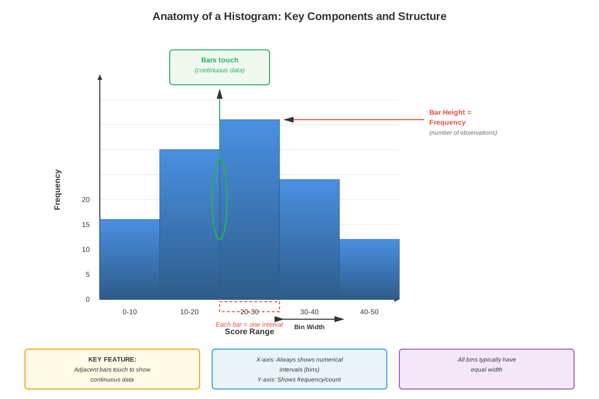
A histogram consists of several essential components that must be understood for accurate interpretation. The horizontal axis (x-axis) represents the variable being measured, divided into consecutive intervals or bins. These intervals are typically of equal width, though GRE questions occasionally feature unequal intervals to test deeper understanding. The vertical axis (y-axis) most commonly represents frequency (the count of observations in each interval), though it may alternatively show relative frequency (proportion or percentage) or density.
The bars in a histogram are adjacent with no gaps between them, visually emphasizing that the data is continuous or represents grouped continuous data. Each bar's height corresponds to the frequency of observations falling within that interval. The width of each bar spans the entire interval it represents. Critically, when intervals have unequal widths, the area of the bar (not just its height) represents the frequency, though this advanced concept appears rarely on the GRE.
Reading and Interpreting Histogram Data
To extract information from a histogram, follow this systematic approach:
- Identify the axes: Determine what variable is being measured (x-axis) and what the y-axis represents (frequency, percentage, or count)
- Note the intervals: Observe the range of each bin and whether intervals are equal or unequal in width
- Read bar heights: Determine the frequency for each interval by reading the height of each bar
- Calculate totals: Sum all frequencies to find the total number of observations
- Perform required calculations: Use the extracted data to compute requested statistics or comparisons
Calculating Statistical Measures from Histograms
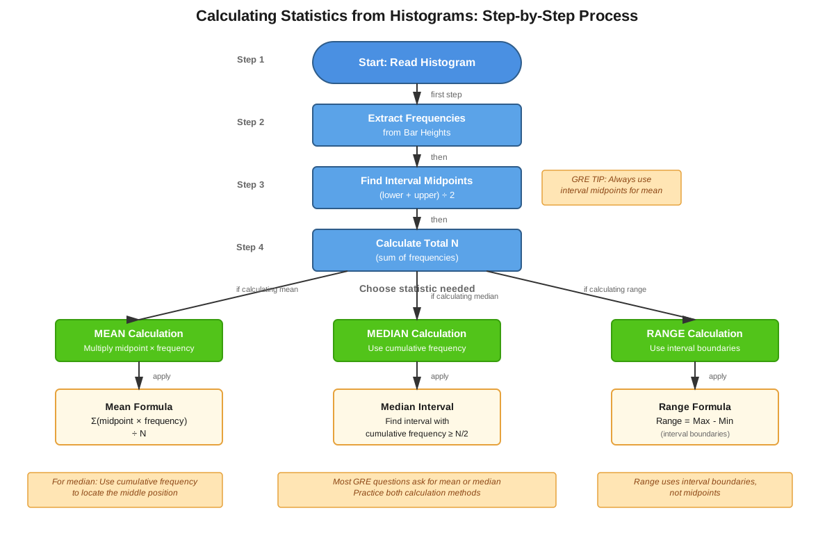
Finding the total number of observations: Sum the frequencies (heights) of all bars. If the y-axis shows percentages, you may need to work with proportions or be given the total separately.
Determining the range: The range is the difference between the maximum possible value (upper bound of the highest interval with data) and the minimum possible value (lower bound of the lowest interval with data).
Identifying the modal class: The modal class or mode is the interval with the highest frequency—the tallest bar in the histogram. Note that for grouped data, you identify the modal interval, not a specific value.
Estimating the median: The median is the middle value when data is ordered. To find it from a histogram:
- Calculate the total number of observations (N)
- Find the position of the median: (N+1)/2 for odd N, or between N/2 and (N/2)+1 for even N
- Cumulate frequencies from left to right until you reach the interval containing the median position
- The median lies somewhere within that interval
Estimating the mean: For grouped data in a histogram:
- Find the midpoint of each interval
- Multiply each midpoint by its frequency
- Sum all these products
- Divide by the total number of observations
This gives an approximation since you're assuming all values in an interval equal the midpoint.
Distribution Shapes and Characteristics
Histograms reveal important characteristics about data distribution:
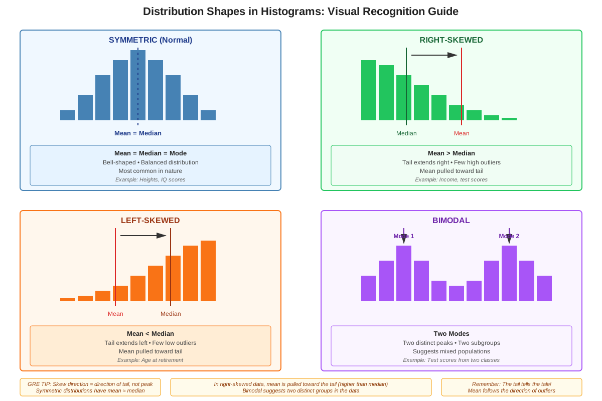
| Distribution Type | Characteristics | Visual Pattern |
|---|---|---|
| Symmetric | Data is evenly distributed around the center | Bell-shaped or uniform appearance |
| Right-skewed (positively skewed) | Tail extends toward higher values | Peak on left, tail on right |
| Left-skewed (negatively skewed) | Tail extends toward lower values | Peak on right, tail on left |
| Uniform | All intervals have approximately equal frequency | Flat, rectangular appearance |
| Bimodal | Two distinct peaks | Two separate high bars |
Common Calculation Types
Percentage calculations: To find what percentage of observations falls within certain criteria:
- Count observations meeting the criteria
- Divide by total observations
- Multiply by 100
Cumulative frequency: The cumulative frequency up to a certain point is the sum of all frequencies in intervals up to and including that point. This is essential for finding medians and percentiles.
Comparing intervals: GRE questions frequently ask you to compare the number of observations in different intervals or combinations of intervals, requiring careful addition and comparison of bar heights.
Concept Relationships
The concepts within histogram interpretation form a hierarchical structure: Basic structure recognition (identifying axes, intervals, and bars) → Data extraction (reading frequencies and calculating totals) → Statistical calculation (computing mean, median, mode, range) → Distribution analysis (identifying shape and making inferences).
Histograms connect directly to prerequisite knowledge of bar graphs, extending that foundation to continuous data representation. They also link forward to more advanced statistical concepts like probability distributions, standard deviation, and normal curves. The relationship between histograms and frequency tables is particularly important: every histogram can be represented as a frequency table, and vice versa, making them alternative representations of the same underlying data.
Within the broader GRE Quantitative Reasoning curriculum, histogram questions often integrate with: Percentages and ratios (calculating what fraction of data meets criteria), Arithmetic operations (summing frequencies, finding differences), Inequalities (determining how many observations are greater than or less than a value), and Logical reasoning (making valid inferences from limited information). This integration makes histogram mastery a multiplier for overall quantitative performance.
High-Yield Facts
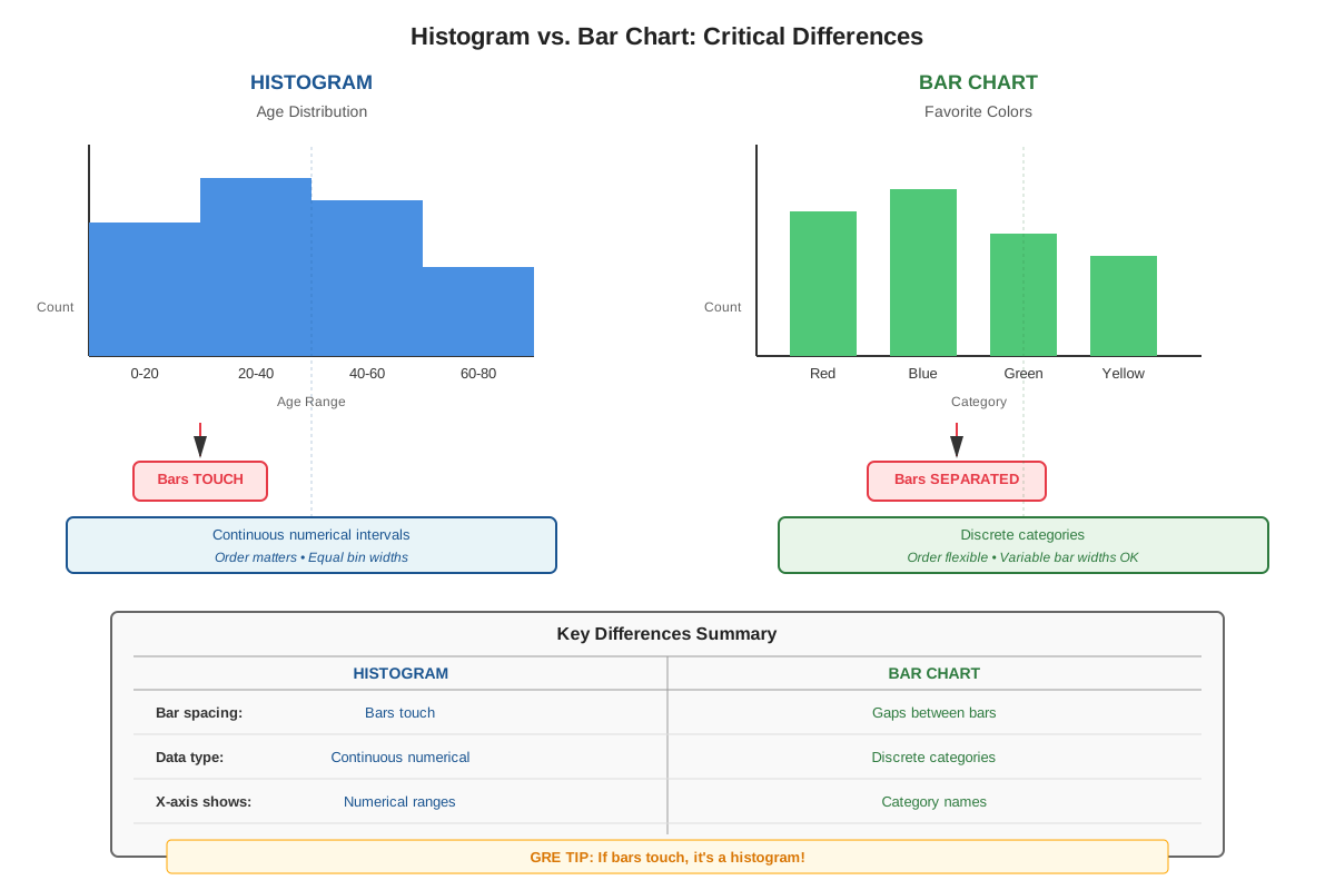
⭐ The bars in a histogram touch each other (no gaps), indicating continuous or grouped continuous data, unlike bar charts where bars are separated
⭐ The modal class is the interval with the highest frequency (tallest bar), not necessarily a specific number
⭐ To find the total number of observations, sum all the frequencies (heights of all bars) unless the y-axis shows percentages
⭐ The median lies in the interval where the cumulative frequency reaches or exceeds 50% of the total observations
⭐ When estimating the mean from a histogram, use the midpoint of each interval multiplied by its frequency, then divide by the total
- The range of data is determined by the lowest and highest intervals that contain observations, not by the tallest bar
- If intervals have unequal widths, pay careful attention to the interval boundaries when counting observations
- The y-axis can represent frequency (count), relative frequency (proportion), or percentage—always check the label
- The area under all bars represents 100% of the data (or the total count if using frequency)
- Histograms cannot show individual data points, only grouped data within intervals
- A symmetric histogram has mean ≈ median ≈ mode; in right-skewed distributions, mean > median > mode
- The width of an interval is calculated as: upper boundary minus lower boundary
Quick check — test yourself on Histograms so far.
Try Flashcards →Common Misconceptions
Misconception: Histograms and bar charts are the same thing and can be used interchangeably.
Correction: Histograms display continuous or grouped numerical data with touching bars, while bar charts show discrete categories with separated bars. The touching bars in histograms emphasize the continuous nature of the variable being measured.
Misconception: The tallest bar in a histogram represents the mean of the data.
Correction: The tallest bar represents the modal class (the interval with the most observations), not the mean. The mean must be calculated using the midpoints of all intervals weighted by their frequencies.
Misconception: You can determine the exact median value from a histogram.
Correction: From a histogram showing grouped data, you can only identify the interval containing the median, not the exact median value, because individual data points within intervals are not shown.
Misconception: If a histogram shows 20% of observations in one interval and 30% in another, there are 50 total observations.
Correction: Percentages don't reveal the total number of observations. You need additional information to determine the actual count. The 20% and 30% are proportions of whatever the total is.
Misconception: The range of a histogram is the difference between the highest and lowest bar heights.
Correction: The range is the difference between the maximum and minimum possible data values (based on the intervals on the x-axis), not the difference in frequencies (bar heights on the y-axis).
Misconception: All intervals in a histogram must be the same width.
Correction: While equal-width intervals are most common and easier to interpret, histograms can have unequal interval widths. When this occurs, careful attention to interval boundaries is essential for accurate interpretation.
Worked Examples
Example 1: Calculating Statistics from a Histogram
Problem: A histogram shows the distribution of test scores for 80 students. The intervals and frequencies are:
- 60-69: 8 students
- 70-79: 20 students
- 80-89: 32 students
- 90-99: 20 students
(a) What is the modal class?
(b) In which interval does the median lie?
(c) What percentage of students scored 80 or above?
Solution:
(a) Finding the modal class:
The modal class is the interval with the highest frequency. Looking at the frequencies: 8, 20, 32, 20. The highest frequency is 32, which corresponds to the 80-89 interval.
Answer: The modal class is 80-89.
(b) Finding the median interval:
First, verify the total: 8 + 20 + 32 + 20 = 80 students ✓
The median position for 80 observations is between the 40th and 41st values.
Calculate cumulative frequencies:
- Up to 69: 8 students
- Up to 79: 8 + 20 = 28 students
- Up to 89: 28 + 32 = 60 students
The 40th and 41st students both fall in the 80-89 interval (since we have 28 students through 79, and the next 32 students are in 80-89).
Answer: The median lies in the 80-89 interval.
(c) Calculating percentage scoring 80 or above:
Students scoring 80 or above = students in 80-89 interval + students in 90-99 interval
= 32 + 20 = 52 students
Percentage = (52/80) × 100 = 65%
Answer: 65% of students scored 80 or above.
Connection to learning objectives: This example demonstrates applying histogram concepts to calculate statistical measures and extract specific information, directly addressing the objectives of explaining core strategies and applying them to GRE-style questions.
Example 2: Comparing Data from a Histogram
Problem: A histogram displays the ages of employees at a company. The y-axis shows the number of employees, and the data shows:
- 20-29 years: 15 employees
- 30-39 years: 25 employees
- 40-49 years: 30 employees
- 50-59 years: 20 employees
- 60-69 years: 10 employees
Quantity A: The number of employees aged 40 or older
Quantity B: The number of employees younger than 40
Which quantity is greater?
Solution:
Step 1: Identify what each quantity requires.
- Quantity A needs: employees in 40-49, 50-59, and 60-69 intervals
- Quantity B needs: employees in 20-29 and 30-39 intervals
Step 2: Calculate Quantity A.
Employees aged 40 or older = 30 + 20 + 10 = 60 employees
Step 3: Calculate Quantity B.
Employees younger than 40 = 15 + 25 = 40 employees
Step 4: Compare.
Quantity A (60) > Quantity B (40)
Answer: Quantity A is greater.
Verification: Check that totals make sense: 60 + 40 = 100 total employees, which matches 15 + 25 + 30 + 20 + 10 = 100 ✓
Connection to learning objectives: This Quantitative Comparison format is extremely common on the GRE and demonstrates the ability to identify when histograms are being tested, extract relevant data, and perform accurate calculations—addressing all three primary learning objectives.
Exam Strategy
Trigger Words: Watch for phrases like "the histogram shows," "frequency distribution," "number of observations in the interval," "what percentage falls between," and "which interval contains the median." These signal histogram questions.
Systematic Approach for GRE Histogram Questions:
- Spend 10-15 seconds orienting (30-45 seconds for complex histograms): Identify what each axis represents, note the intervals, and check whether the y-axis shows frequency, percentage, or relative frequency.
- Calculate the total immediately if not given: Sum all bar heights (if showing frequency). Write this number down—you'll likely need it multiple times.
- For Quantitative Comparison questions: Determine exactly what each quantity requires before calculating. Often one quantity is easier to calculate than the other, or you can compare without calculating exact values.
- For percentage questions: Always use the formula (part/total) × 100, and verify your denominator is the correct total.
- For median questions: Use cumulative frequency rather than trying to estimate visually. Find the middle position, then cumulate from left to right.
Process of Elimination Tips:
- Eliminate answer choices that exceed the total number of observations
- For percentage questions, eliminate choices greater than 100% or negative percentages
- If asked for the median interval, eliminate intervals that clearly contain less than half the cumulative data
- For mean estimates, eliminate extreme values that fall outside the range of the data
Time Management: Allocate 1.5-2 minutes for straightforward histogram questions, up to 2.5 minutes for complex multi-step problems. If a question requires calculating both mean and median, consider whether you can eliminate answers after calculating just one measure.
Common Traps to Avoid:
- Confusing the modal class (tallest bar) with the mean or median
- Using bar heights when the question asks about data values (x-axis) or vice versa
- Forgetting to check whether the y-axis shows counts or percentages
- Miscounting intervals when determining ranges or cumulative frequencies
Memory Techniques
HISTOGRAM Mnemonic for systematic analysis:
- Height = frequency (read the y-axis)
- Intervals = check the x-axis ranges
- Sum = calculate total observations
- Tallest = identifies modal class
- Order = arrange data mentally for median
- Grouped = remember data is grouped, not individual
- Range = highest interval minus lowest interval
- Area = all bars together = 100% of data
- Midpoint = use for mean calculations
Visualization Strategy: When looking at a histogram, mentally draw a vertical line at the 50% cumulative frequency point—this helps you quickly identify where the median interval is located.
"Touch or Gap" Rule: If bars touch → histogram (continuous data); if bars have gaps → bar chart (categorical data). This simple visual check helps you identify the graph type instantly.
Mean-Median-Mode Relationship Acronym: "SMR" for Skewed distributions:
- Skewed right: Mean > Median > Mode
- Middle (symmetric): Mean = Median = Mode
- Reverse (skewed left): Mode > Median > Mean
Summary
Histograms are essential graphical representations of frequency distributions that appear consistently on the GRE Quantitative Reasoning section. Mastery requires understanding their structure (continuous intervals with touching bars), accurately reading both axes (typically intervals on x-axis, frequency on y-axis), and performing calculations including totals, percentages, and statistical measures. The modal class is identified as the tallest bar, the median is found using cumulative frequency to locate the middle observation's interval, and the mean is estimated using interval midpoints weighted by frequencies. Successful histogram interpretation demands careful attention to what each axis represents, systematic calculation of totals, and awareness of common traps such as confusing frequency with data values or misidentifying the modal class as the mean. Students must practice extracting information efficiently, as histogram questions often integrate multiple quantitative skills including percentages, ratios, and statistical reasoning within time-constrained testing conditions.
Key Takeaways
- Histograms display continuous or grouped data with adjacent touching bars, where bar height represents frequency and the x-axis shows intervals
- Always identify what the y-axis represents (frequency, percentage, or relative frequency) before performing any calculations
- The modal class is the interval with the highest frequency (tallest bar), not the mean or median
- Calculate the total number of observations by summing all frequencies, and use this total as the denominator for percentage calculations
- Find the median interval using cumulative frequency: locate where the cumulative count reaches 50% of the total observations
- Estimate the mean by multiplying each interval's midpoint by its frequency, summing these products, and dividing by the total
- Distribution shape affects the relationship between mean, median, and mode: symmetric distributions have all three approximately equal, while skewed distributions show predictable ordering
Related Topics
Frequency Tables and Distributions: Histograms are visual representations of frequency tables; understanding how to convert between these formats strengthens interpretation skills and provides alternative problem-solving approaches.
Box Plots and Quartiles: These graphical representations show data distribution using five-number summaries; mastering histograms provides the foundation for understanding how data spreads across quartiles.
Probability from Data: Histogram frequencies can be converted to probabilities by dividing by the total number of observations, connecting data analysis to probability concepts.
Measures of Spread (Range, Standard Deviation): While histograms directly show range, they also provide visual insight into data variability, preparing students for more advanced statistical measures.
Normal Distribution and Bell Curves: Symmetric histograms approximate normal distributions; understanding histogram shapes builds intuition for this fundamental statistical concept.
Practice CTA
Now that you've mastered the core concepts of histogram interpretation, it's time to solidify your understanding through active practice. Attempt the practice questions to apply these strategies to GRE-style problems, and use the flashcards to reinforce key definitions and formulas. Remember: histogram questions are high-yield and highly predictable—consistent practice with these question types will directly translate to points on test day. Focus on speed and accuracy, aiming to complete straightforward histogram questions in under 90 seconds while maintaining perfect accuracy. Your investment in mastering this topic will pay dividends across multiple questions on your GRE!
Sign up free to keep reading
Create a free AnvayaPrep account to finish this GRE guide on Histograms — plus flashcards and practice questions.