Overview
Pie charts are one of the most frequently tested data visualization formats in the GRE Quantitative Reasoning section, appearing regularly in Data Interpretation questions. These circular graphs divide a whole into proportional sectors, where each "slice" represents a category's percentage or fractional contribution to the total. Understanding how to extract, manipulate, and calculate information from pie charts is essential for achieving a competitive GRE score, as these questions often combine multiple mathematical concepts including percentages, fractions, ratios, and basic arithmetic operations.
The GRE tests pie chart interpretation in sophisticated ways that go beyond simple reading of labeled percentages. Test-makers design questions that require students to calculate missing values, compare multiple pie charts, determine absolute quantities from percentages, and perform multi-step calculations involving proportional reasoning. GRE pie charts frequently appear alongside other data representations such as bar graphs or tables, requiring students to synthesize information across multiple sources within strict time constraints.
Mastery of pie chart questions connects directly to broader Quantitative Reasoning competencies including proportional reasoning, percentage calculations, and data analysis skills. These questions assess not only computational ability but also visual literacy and the capacity to translate between different mathematical representations (percentages, decimals, fractions, and absolute values). Strong performance on pie chart questions demonstrates the analytical thinking and quantitative fluency that graduate programs value, making this a high-yield topic worthy of focused study and practice.
Learning Objectives
- [ ] Identify when Pie charts is being tested
- [ ] Explain the core rule or strategy behind Pie charts
- [ ] Apply Pie charts to GRE-style questions accurately
- [ ] Convert between percentages, degrees, and absolute values in pie chart contexts
- [ ] Synthesize information from multiple pie charts to solve complex problems
- [ ] Recognize and avoid common calculation traps in pie chart questions
- [ ] Execute multi-step calculations efficiently under timed conditions
Prerequisites
- Percentage calculations: Converting between percentages, decimals, and fractions is fundamental to interpreting pie chart sectors
- Basic arithmetic operations: Addition, subtraction, multiplication, and division are required for all pie chart calculations
- Proportional reasoning: Understanding part-to-whole relationships enables accurate interpretation of sector sizes
- Fraction operations: Many pie chart questions require working with fractional parts of the total
- Circle geometry basics: Knowing that a circle contains 360 degrees helps when sectors are expressed in degrees rather than percentages
Why This Topic Matters
Pie charts appear in approximately 15-20% of all GRE Data Interpretation questions, making them one of the most frequently tested visualization formats. The Educational Testing Service (ETS) favors pie charts because they efficiently assess multiple quantitative skills simultaneously: percentage fluency, proportional reasoning, estimation abilities, and multi-step problem-solving. Questions involving pie charts typically appear in sets of 2-3 questions based on the same chart or set of charts, meaning that understanding this format can unlock multiple points in a single question set.
In real-world contexts, pie charts are ubiquitous in business reports, scientific publications, government statistics, and financial documents. Graduate programs across disciplines expect students to interpret and create data visualizations, making pie chart literacy a practical skill beyond test preparation. The ability to quickly extract meaningful insights from proportional data representations is essential in fields ranging from business analytics to public health to social sciences.
On the GRE, pie chart questions commonly appear in several formats: single pie charts with missing information that must be calculated; multiple pie charts representing different years, populations, or categories that must be compared; and combination questions where pie charts appear alongside tables or bar graphs. The exam frequently tests whether students can move fluidly between percentages and absolute values, recognize when calculations are necessary versus when estimation suffices, and avoid common traps such as comparing percentages across pie charts with different totals.
Core Concepts
Understanding Pie Chart Structure
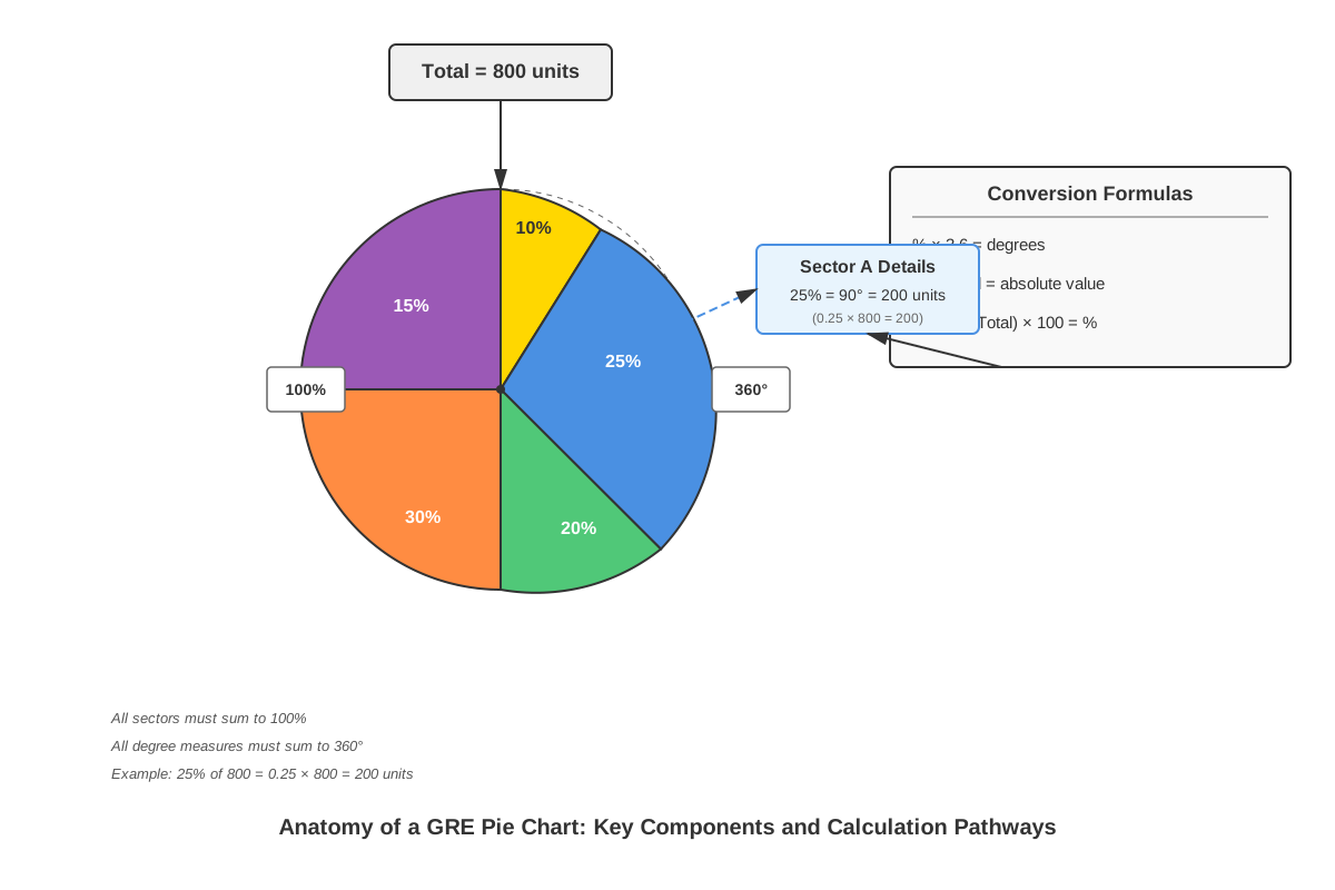
A pie chart (also called a circle graph) represents data as sectors of a circle, where the entire circle represents 100% of the data set or the total quantity being measured. Each sector's size is proportional to the quantity it represents, with the angle of each sector calculated using the formula: (Category Value / Total Value) × 360°. The visual nature of pie charts makes them excellent for showing composition and relative proportions at a glance.
Key structural elements include:
- Total value: The sum of all categories, representing the complete circle (100% or 360°)
- Sectors: Individual "slices" representing categories or subcategories
- Labels: Text identifying what each sector represents
- Values: Numbers showing either percentages, absolute quantities, or both
- Legend: Optional key explaining sector meanings, particularly when colors or patterns are used
Converting Between Representations
GRE pie chart questions frequently require converting between three representations: percentages, degrees, and absolute values. Mastering these conversions is essential for efficient problem-solving.
| Representation | Relationship to Total | Conversion Formula |
|---|---|---|
| Percentage | Part of 100% | (Sector Value / Total) × 100% |
| Degrees | Part of 360° | (Sector Value / Total) × 360° |
| Absolute Value | Actual quantity | (Percentage / 100) × Total |
Example: If a sector represents 15% of a pie chart and the total is 2,400 units:
- Degrees: 15% × 360° = 54°
- Absolute value: 0.15 × 2,400 = 360 units
The reverse calculation is equally important: if given that a sector contains 450 units from a total of 3,000 units, the percentage is (450/3,000) × 100% = 15%.
Calculating Missing Information
Many GRE pie chart questions deliberately omit certain values, requiring students to calculate them using the constraint that all sectors must sum to 100% (or 360°). This tests whether students understand the fundamental property that pie charts represent complete wholes.
Process for finding missing percentages:
- Add all given percentages
- Subtract the sum from 100%
- The remainder represents the missing sector(s)
Process for finding missing absolute values:
- Determine the total quantity (may be given or need calculation)
- Calculate known sectors' absolute values
- Subtract from total to find missing values, OR
- Use the missing percentage to calculate directly
Comparing Multiple Pie Charts
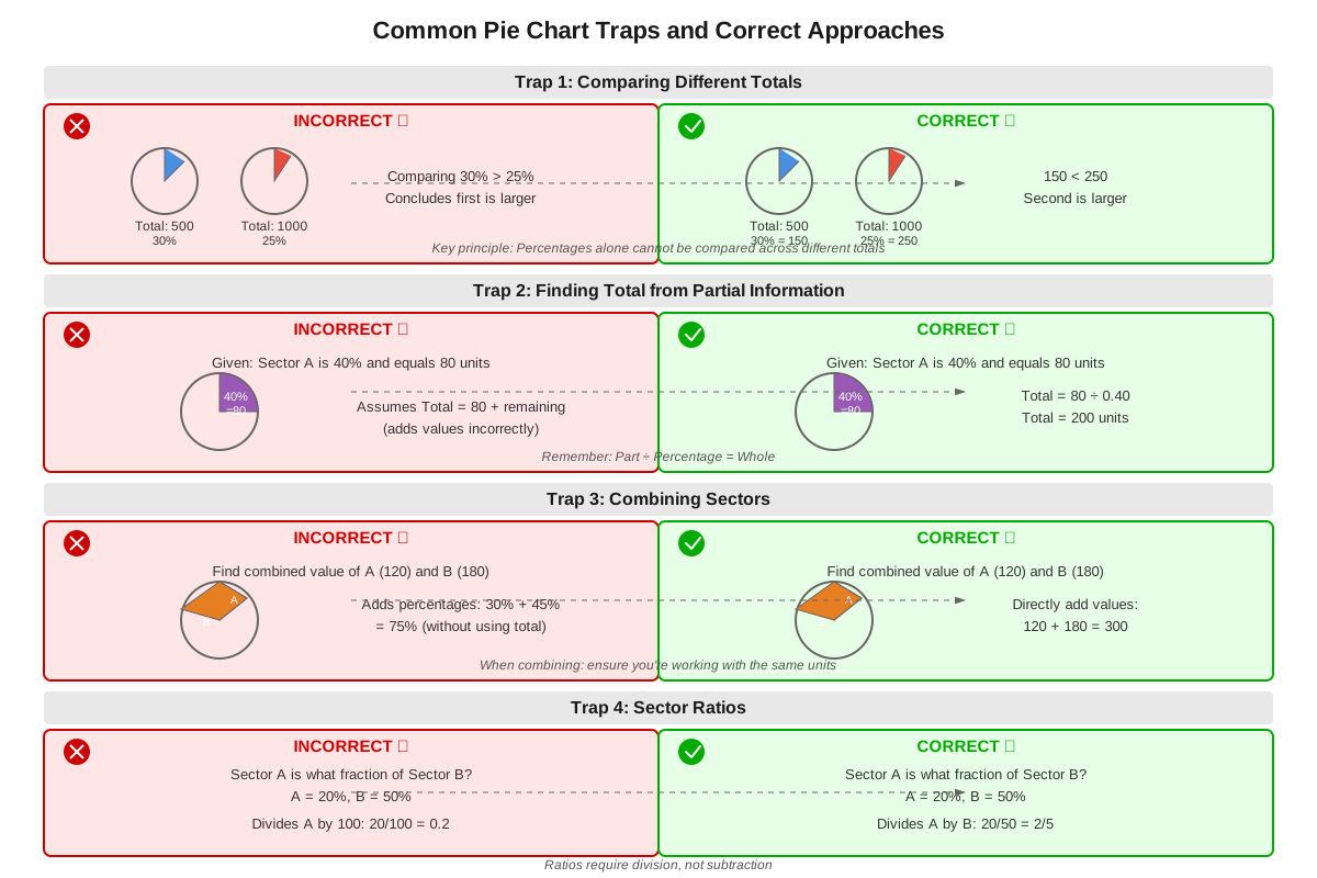
GRE questions frequently present two or more pie charts representing different populations, time periods, or categories. The critical insight is that percentages from different pie charts cannot be directly compared unless the totals are equal. A larger percentage from a smaller total may represent fewer absolute units than a smaller percentage from a larger total.
Strategy for multi-chart comparisons:
- Identify the total for each pie chart
- Convert relevant percentages to absolute values
- Compare absolute values, not percentages
- Watch for questions asking about percentage point differences versus absolute differences
Example: Chart A shows 30% of 1,000 (= 300 units) while Chart B shows 25% of 1,600 (= 400 units). Despite the lower percentage, Chart B has more absolute units.
Estimation Techniques
Given the GRE's time constraints, estimation is often more efficient than precise calculation, particularly for Quantitative Comparison questions or when answer choices are widely spaced. Visual estimation skills can save valuable seconds.
Estimation guidelines:
- Sectors near 25% occupy approximately one-quarter of the circle
- Sectors near 50% occupy approximately half the circle
- Sectors near 10% are roughly one-tenth of the circle
- Very small sectors (< 5%) appear as thin slivers
- Compare sector sizes visually before calculating when possible
Multi-Step Calculations
Complex GRE pie chart questions often require chaining multiple calculations together. These questions test both conceptual understanding and computational accuracy under pressure.
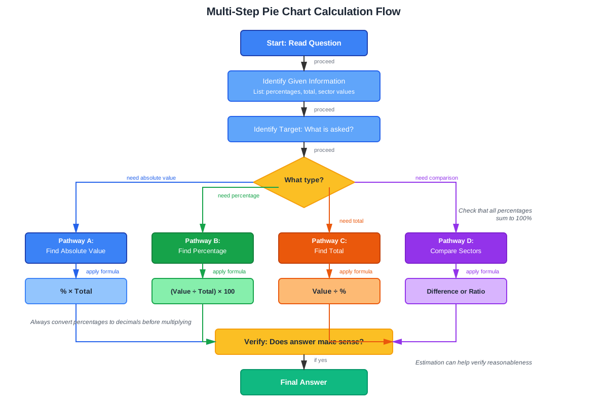
Common multi-step patterns:
- Calculate absolute value from percentage → Use that value in a ratio or comparison
- Find missing percentage → Convert to absolute value → Perform arithmetic operation
- Compare values across two charts → Calculate difference → Express as percentage change
- Calculate subtotal from multiple sectors → Use as denominator for new percentage
Example sequence: "If Category A represents 35% of the 2,000 total units, and Category B represents 40% more units than Category A, what percentage of the total does Category B represent?"
- Step 1: Calculate A's absolute value: 0.35 × 2,000 = 700 units
- Step 2: Calculate B's absolute value: 700 × 1.40 = 980 units
- Step 3: Convert B to percentage: (980/2,000) × 100% = 49%
Concept Relationships
The concepts within pie chart interpretation form a hierarchical structure where foundational understanding enables progressively complex applications. Understanding pie chart structure serves as the base, establishing that sectors represent proportional parts of a whole. This foundation directly enables converting between representations, as recognizing the part-to-whole relationship allows translation between percentages, degrees, and absolute values.
Converting between representations → enables → Calculating missing information, because once students can move fluidly between different numerical expressions, they can use the constraint that all parts sum to the whole to find unknown values. Similarly, Calculating missing information → supports → Multi-step calculations, as complex problems often require first determining unstated values before proceeding with the main calculation.
Comparing multiple pie charts builds upon all previous concepts, requiring students to convert percentages to absolute values, recognize when totals differ, and avoid the trap of comparing percentages directly. Estimation techniques serve as a parallel skill that can accelerate any of the other concepts, providing quick reasonableness checks and enabling strategic time management.
These pie chart concepts connect to prerequisite knowledge of percentage calculations (the mathematical foundation for all conversions), proportional reasoning (understanding part-to-whole relationships), and basic arithmetic (executing the calculations). They also connect forward to more advanced data interpretation topics including bar graphs, line graphs, and multi-source reasoning questions where pie charts appear alongside other data formats.
Quick check — test yourself on Pie charts so far.
Try Flashcards →High-Yield Facts
⭐ All sectors in a pie chart must sum to exactly 100% (or 360°) — this constraint enables calculation of missing values
⭐ Percentages from different pie charts cannot be directly compared unless the totals are equal — always convert to absolute values first
⭐ To find absolute value from percentage: multiply the percentage (as decimal) by the total — this is the most common calculation type
⭐ To find percentage from absolute value: divide the sector value by the total and multiply by 100% — essential for reverse calculations
⭐ A sector representing 25% occupies exactly 90° of the circle — useful benchmark for estimation (25% = 1/4 = 90°)
- When comparing sectors across different pie charts, calculate absolute values before making comparisons
- The largest sector in a pie chart may not represent the largest absolute quantity if comparing across charts with different totals
- Percentage point difference and percentage change are different calculations — read questions carefully
- If a pie chart shows only some percentages, the unlabeled sector(s) can be found by subtracting labeled percentages from 100%
- Questions asking "approximately" or "closest to" signal that estimation is acceptable and often more efficient than precise calculation
- When multiple sectors must be combined, add their percentages first, then convert to absolute value (more efficient than converting each separately)
- A sector's degree measure equals its percentage multiplied by 3.6 (since 360°/100% = 3.6)
- If answer choices are widely spaced (e.g., 100, 200, 300, 400), visual estimation may be sufficient without calculation
- "What fraction" questions require expressing the answer as a simplified fraction, not a percentage or decimal
- Pie charts showing budget allocations, market share, or demographic breakdowns are the most common contexts on the GRE
Common Misconceptions
Misconception: Larger sectors in different pie charts always represent more absolute units than smaller sectors.
Correction: Sector size shows percentage of that chart's total only. A 20% sector from a total of 10,000 (= 2,000 units) contains more than a 40% sector from a total of 3,000 (= 1,200 units). Always convert to absolute values when comparing across charts.
Misconception: If a sector looks like about one-third of the circle, it represents exactly 33.33%.
Correction: Visual estimation is useful but imprecise. Pie charts can be drawn with slight distortions, and human visual perception is imperfect. Use visual estimation for quick checks or when questions ask for approximations, but calculate precisely when exact answers are required.
Misconception: The percentage point difference between two percentages is the same as the percentage change.
Correction: These are different calculations. If a sector increases from 20% to 30%, the percentage point difference is 10 percentage points (30% - 20%), but the percentage change is 50% [(30-20)/20 × 100%]. Read questions carefully to determine which is being asked.
Misconception: When a pie chart doesn't show all sector labels, the missing information cannot be determined.
Correction: The constraint that all sectors sum to 100% means missing percentages can always be calculated by subtracting the sum of known percentages from 100%. Similarly, if the total is known, missing absolute values can be calculated.
Misconception: Combining two sectors that represent 15% and 20% of different pie charts gives 35% of something.
Correction: Percentages from different pie charts cannot be added directly because they represent proportions of different totals. Convert each to absolute values first, add those values, then determine what percentage that sum represents of whichever total is relevant to the question.
Misconception: A pie chart showing percentages doesn't provide enough information to answer questions about absolute quantities.
Correction: If the total quantity is provided anywhere in the question (in the chart title, axis label, or question text), absolute values can be calculated by multiplying percentages by the total. GRE questions always provide sufficient information to reach the answer.
Worked Examples
Example 1: Single Pie Chart with Missing Information
Question: The pie chart below shows the distribution of 3,600 students across five academic departments. The Engineering department represents 28%, Sciences represents 22%, Humanities represents 18%, and Business represents 15%. How many students are in the Arts department?
Solution:
Step 1: Identify what's being asked — the absolute number of students in Arts.
Step 2: Calculate the percentage for Arts using the constraint that all sectors sum to 100%:
- Known percentages: 28% + 22% + 18% + 15% = 83%
- Arts percentage: 100% - 83% = 17%
Step 3: Convert the percentage to absolute value:
- Arts students = 17% of 3,600
- Arts students = 0.17 × 3,600 = 612
Answer: 612 students
Key insight: This problem tests the fundamental property that pie chart sectors must sum to 100%, combined with the ability to convert percentages to absolute values. The multi-step nature (first finding the percentage, then converting to absolute value) is typical of medium-difficulty GRE questions.
Example 2: Comparing Multiple Pie Charts
Question: Company A's revenue of $800,000 is distributed as follows: Product X (35%), Product Y (40%), Product Z (25%). Company B's revenue of $1,200,000 is distributed as: Product X (30%), Product Y (25%), Product Z (45%). Which company earned more revenue from Product Y, and by how much?
Solution:
Step 1: Recognize that percentages cannot be compared directly because the totals differ.
Step 2: Calculate absolute revenue from Product Y for Company A:
- Company A, Product Y = 40% of $800,000
- Company A, Product Y = 0.40 × $800,000 = $320,000
Step 3: Calculate absolute revenue from Product Y for Company B:
- Company B, Product Y = 25% of $1,200,000
- Company B, Product Y = 0.25 × $1,200,000 = $300,000
Step 4: Compare and find the difference:
- Company A earned more: $320,000 - $300,000 = $20,000 more
Answer: Company A earned $20,000 more from Product Y
Key insight: This problem illustrates the critical error of comparing percentages across different totals. Despite Company A having a higher percentage (40% vs. 25%), the calculation reveals it earned only slightly more in absolute terms. This type of question frequently appears on the GRE because it tests whether students understand the difference between relative proportions and absolute quantities.
Exam Strategy
When approaching GRE pie chart questions, begin by quickly scanning for the total value — this number is essential for most calculations and may appear in the chart title, a label, or the question text. If the total isn't immediately visible, check whether it can be calculated from given information. Next, identify whether the question asks for percentages, absolute values, or comparisons, as this determines your calculation approach.
Trigger words and phrases to watch for:
- "Approximately" or "closest to" → estimation is acceptable and often faster
- "What fraction" → answer must be a simplified fraction, not percentage or decimal
- "How many more" → calculate absolute difference between values
- "What percent greater" → calculate percentage change, not percentage point difference
- "Combined" or "total" → add multiple sectors together
- "Compared to" or "versus" → likely comparing across different pie charts
Process-of-elimination strategies:
- Eliminate answers that exceed the total (if asking for absolute values)
- Eliminate answers that exceed 100% (if asking for percentages)
- Use visual estimation to eliminate unreasonable answers before calculating
- For Quantitative Comparison questions, estimate whether values are close before calculating precisely
- Check whether answer choices are percentages or absolute values — mismatching units is a common trap
Time allocation advice: Allocate approximately 1.5-2 minutes per pie chart question. If a question requires extensive calculation and you're running short on time, use estimation to eliminate obviously wrong answers, make an educated guess, and move forward. Questions with multiple pie charts may take slightly longer but often yield multiple questions from the same setup, making them time-efficient overall. If you find yourself spending more than 2.5 minutes on a single pie chart question, mark it for review and move on to maintain pacing.
Exam Tip: When multiple questions reference the same pie chart, calculate and note commonly needed values (like the absolute value of large sectors) after the first question. This investment saves time on subsequent questions.
Memory Techniques
Mnemonic for conversion formulas — "PTA": Percentage × Total = Absolute value. This reminds you that multiplying percentage (as decimal) by total gives the absolute value, the most common calculation.
Visualization strategy — "Quarter Benchmarks": Mentally divide any pie chart into quarters (25% each). This creates visual benchmarks: sectors larger than a quarter exceed 25%, sectors about half the circle are near 50%, sectors smaller than a quarter are under 25%. This enables rapid estimation without calculation.
Acronym for multi-chart comparisons — "TACO": Totals differ? Always Convert to Original absolute values. This reminds you never to compare percentages directly across pie charts with different totals.
The "100% Rule" reminder: Visualize a pie chart as a pizza that must be completely distributed — no slices missing, no extra slices. This reinforces that sectors must sum to exactly 100%, enabling calculation of missing values.
Degree-Percentage relationship — "3.6 Trick": Remember that 1% = 3.6°. This comes from 360°/100% = 3.6. Multiply any percentage by 3.6 to get degrees, or divide degrees by 3.6 to get percentage. While not frequently needed, this can be useful for questions presenting sector sizes in degrees.
Summary
Pie charts are high-yield GRE data visualizations that test multiple quantitative skills simultaneously: percentage fluency, proportional reasoning, and multi-step problem-solving. Success requires understanding that pie charts represent complete wholes where all sectors sum to 100% (or 360°), enabling calculation of missing information. The most critical skill is converting fluidly between percentages and absolute values using the formula: absolute value = percentage (as decimal) × total. When comparing multiple pie charts, students must recognize that percentages cannot be compared directly unless totals are equal — always convert to absolute values first. Efficient performance combines precise calculation for exact answers with strategic estimation when questions allow approximation or when eliminating unreasonable answer choices. The GRE tests pie chart interpretation through single-chart questions requiring missing value calculations, multi-chart comparisons demanding absolute value conversions, and complex multi-step problems chaining several operations together. Mastery requires both conceptual understanding of part-to-whole relationships and computational accuracy under timed conditions.
Key Takeaways
- All sectors in a pie chart must sum to exactly 100%, enabling calculation of any missing percentage by subtracting known percentages from 100%
- Convert percentages to absolute values by multiplying the percentage (as decimal) by the total: absolute value = percentage × total
- Never compare percentages directly across pie charts with different totals — always convert to absolute values first
- Use visual estimation strategically: sectors near 25% occupy about one-quarter of the circle, sectors near 50% occupy about half
- Multi-step pie chart problems typically require first finding missing information, then converting between representations, then performing the final calculation
- Watch for trigger words: "approximately" signals estimation is acceptable, while "what fraction" requires a fractional answer format
- The most common GRE pie chart calculations are: finding missing percentages, converting percentages to absolute values, and comparing values across multiple charts
Related Topics
Bar Graphs and Histograms: These visualizations complement pie charts by showing comparisons across categories using rectangular bars rather than circular sectors. Mastering pie charts provides the proportional reasoning foundation needed for interpreting bar graphs, particularly when questions require calculating percentages from bar heights.
Tables and Data Interpretation: Many GRE questions combine pie charts with tables, requiring synthesis of information across multiple formats. Strong pie chart skills enable efficient extraction of proportional data that can be cross-referenced with tabular information.
Percentage and Ratio Problems: The percentage calculations central to pie chart interpretation directly apply to standalone percentage problems throughout the Quantitative Reasoning section. Mastery of pie chart conversions strengthens overall percentage fluency.
Quantitative Comparison with Data: Pie chart data frequently appears in Quantitative Comparison questions where two quantities derived from chart information must be compared. The estimation techniques learned for pie charts are particularly valuable in this question format.
Practice CTA
Now that you've mastered the core concepts, strategies, and common traps for GRE pie chart questions, it's time to solidify your understanding through active practice. Attempt the practice questions to apply these techniques under realistic conditions, paying special attention to multi-step problems and multi-chart comparisons. Use the flashcards to reinforce quick recall of key formulas and conversion techniques. Remember that pie chart mastery comes from recognizing patterns across multiple problems — each practice question you complete strengthens your ability to identify question types and execute efficient solution strategies. Your investment in deliberate practice with pie charts will pay dividends across the entire Data Interpretation section of the GRE!
Sign up free to keep reading
Create a free AnvayaPrep account to finish this GRE guide on Pie charts — plus flashcards and practice questions.