Overview
Data interpretation is one of the most frequently tested skills in the GRE Quantitative Reasoning section, appearing in approximately 25-30% of all quantitative questions. Unlike pure computational problems, GRE data interpretation questions require test-takers to extract, analyze, and synthesize information from visual representations such as tables, bar graphs, line graphs, pie charts, and scatter plots. These questions assess not just mathematical ability, but also analytical reasoning, attention to detail, and the capacity to work efficiently under time pressure.
The GRE presents data interpretation questions in a unique format: multiple questions (typically 2-3) based on a single set of data displays. This format rewards students who can quickly identify relevant information, perform accurate calculations, and avoid common traps related to misreading scales, confusing percentages with absolute values, or making unwarranted assumptions. Mastery of data interpretation is essential because these questions often determine the difference between a good score and an excellent score—they test practical quantitative literacy rather than abstract mathematical knowledge.
Data interpretation connects to virtually every other topic in GRE Quantitative Reasoning. Students must apply arithmetic operations, percentages, ratios, basic statistics, and estimation techniques while navigating visual information. The skill integrates computational accuracy with strategic thinking, making it a cornerstone of quantitative success. Strong performance on data interpretation questions demonstrates the real-world analytical abilities that graduate programs value, as these skills mirror the data analysis required in academic research and professional settings.
Learning Objectives
- [ ] Identify when Data interpretation is being tested
- [ ] Explain the core rule or strategy behind Data interpretation
- [ ] Apply Data interpretation to GRE-style questions accurately
- [ ] Extract precise numerical values from various graph types within 30 seconds
- [ ] Distinguish between questions requiring exact calculations versus estimation
- [ ] Recognize and avoid common data interpretation traps (scale misreading, unit confusion, percentage errors)
- [ ] Efficiently navigate multi-part data sets to locate relevant information for each question
Prerequisites
- Basic arithmetic operations (addition, subtraction, multiplication, division): Essential for performing calculations with extracted data values
- Percentages and percent change: Required to interpret relative changes and proportional relationships in data sets
- Ratios and proportions: Necessary for comparing values across categories and understanding relative magnitudes
- Reading numerical scales: Fundamental for accurately extracting values from axes and legends
- Basic statistics concepts (mean, median, range): Often tested when analyzing data distributions and central tendencies
Why This Topic Matters
Data interpretation skills extend far beyond standardized testing into virtually every professional and academic domain. Graduate students regularly encounter research papers with complex figures, business reports with financial data, and scientific studies with experimental results. The ability to quickly extract meaningful insights from visual data representations is a fundamental literacy skill in the modern information economy.
On the GRE specifically, data interpretation questions appear in dedicated question sets where 2-3 questions share a common data display. These sets typically appear 2-3 times per Quantitative Reasoning section, accounting for 6-9 questions out of the 20 questions per section. The questions range from straightforward value extraction to complex multi-step calculations involving multiple data sources. Because these questions are grouped, strong data interpretation skills allow test-takers to work efficiently, often completing all questions in a set faster than isolated problems.
The GRE tests data interpretation through several common question formats: direct value lookup questions, comparison questions (which category is largest/smallest), calculation questions requiring arithmetic operations on extracted values, percentage and ratio questions, trend identification questions, and inference questions requiring synthesis of multiple data points. Understanding these patterns allows strategic preparation and efficient test-day execution.
Core Concepts
Types of Data Displays
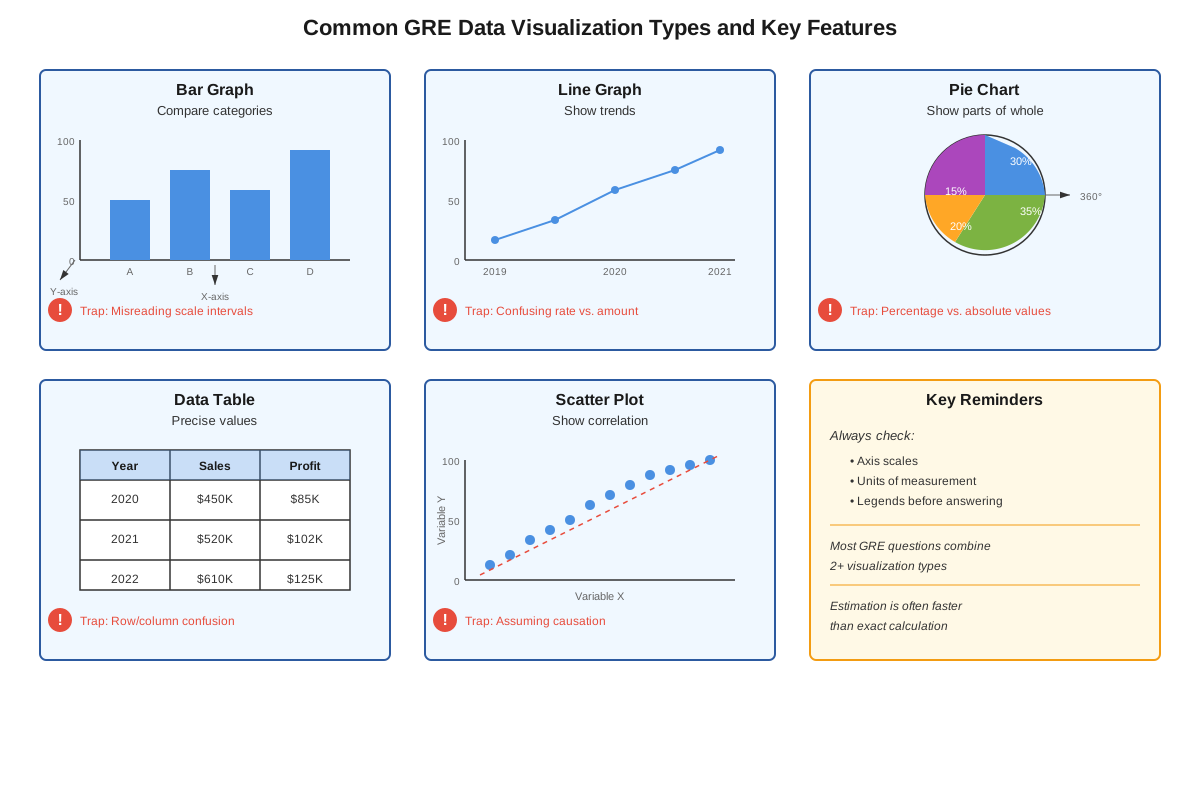
The GRE employs five primary data visualization formats, each with distinct characteristics and common pitfalls. Bar graphs display categorical data using rectangular bars whose lengths represent values, with bars oriented either vertically or horizontally. These graphs excel at comparing discrete categories but require careful attention to scale intervals. Line graphs show continuous data over time or across ordered categories, with points connected by lines to emphasize trends and patterns. The slope between points indicates rate of change, making these ideal for temporal analysis.
Pie charts (or circle graphs) represent parts of a whole, with each sector's angle proportional to its percentage of the total. These displays are limited to showing relative proportions and always sum to 100%. Tables organize data in rows and columns, offering precise numerical values without graphical interpretation but requiring careful navigation to locate specific information. Scatter plots display relationships between two variables using individual points, though these appear less frequently on the GRE.
Reading Scales and Axes Accurately
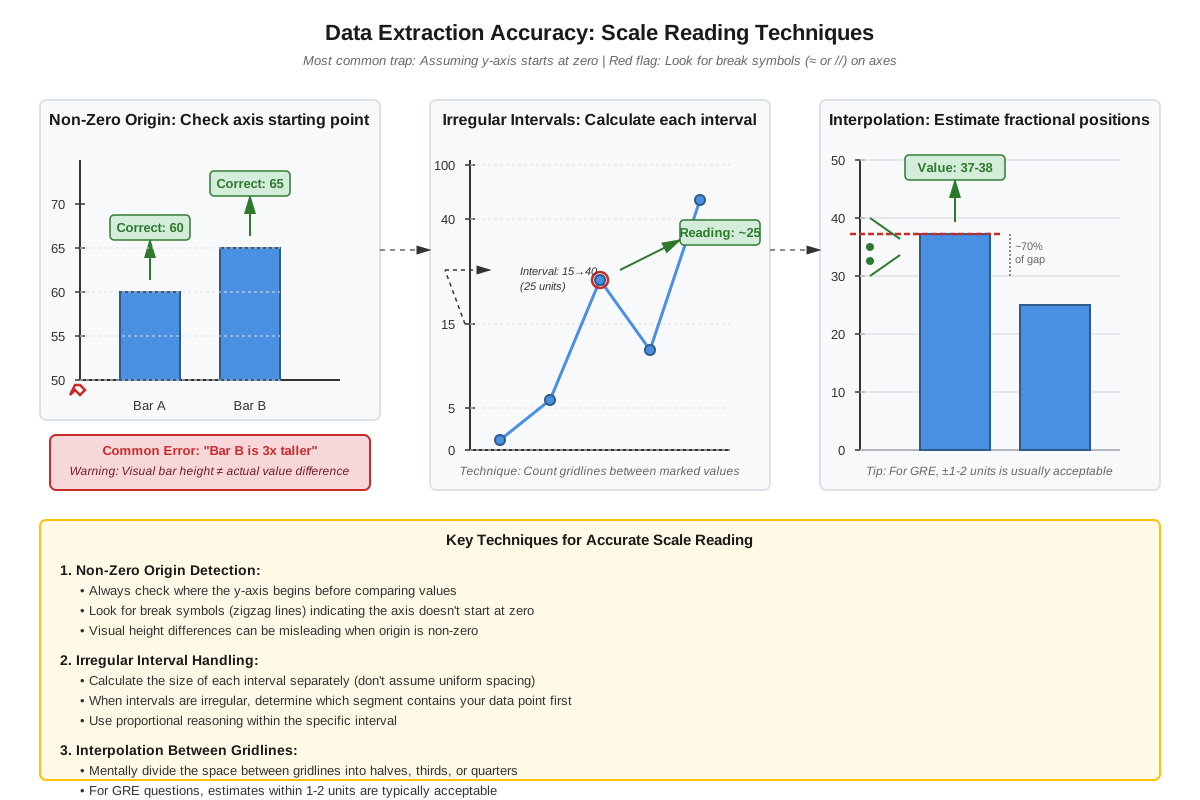
Scale interpretation is the foundation of accurate data extraction. The GRE frequently uses non-standard scales to test attention to detail. Always identify the scale increment by examining the difference between consecutive labeled values. For example, if an axis shows 0, 50, 100, each grid line represents 50 units, not 10. Broken axes (indicated by a zigzag symbol) skip a range of values, compressing the visual display—this can exaggerate apparent differences between values.
Pay special attention to axis labels and units. A graph showing "Revenue (in thousands)" means a displayed value of 50 represents 50,000, not 50. Similarly, "Population (millions)" requires multiplying displayed values by 1,000,000. The GRE exploits unit confusion as a primary trap, so always verify units before calculating. Legends identify what different colors, patterns, or line styles represent—misreading legends leads to extracting values from the wrong data series.
Calculation Strategies
Direct extraction questions require reading a single value from the display. Locate the relevant category or time point, trace to the corresponding bar height, line point, or table cell, and read the value using the scale. For values between labeled scale marks, estimate proportionally. If a bar reaches halfway between 40 and 60, the value is approximately 50.
Comparison questions ask which category has the highest/lowest value or how two values relate. Rather than extracting exact numbers, visually compare heights, lengths, or positions. This saves time and reduces calculation errors. Only extract specific values if the visual comparison is ambiguous or if the question requires the numerical difference.
Multi-step calculations require extracting multiple values and performing operations. Common operations include:
- Sums: Adding values across categories or time periods
- Differences: Subtracting to find change or gap between values
- Averages: Summing values and dividing by count
- Percentages: Calculating part/whole × 100 or percent change (new - old)/old × 100
- Ratios: Expressing one value relative to another
Percentage vs. Absolute Value Distinction
A critical concept in GRE data interpretation is distinguishing between absolute values (actual quantities) and relative values (percentages or proportions). A category can have the largest percentage increase while having the smallest absolute increase. For example, if Category A increases from 10 to 20 (100% increase) and Category B increases from 100 to 150 (50% increase), Category A has the larger percentage change but Category B has the larger absolute change (50 vs. 10).
Always identify what the question asks: "greatest increase" typically means absolute change, while "greatest percent increase" or "greatest relative change" means percentage change. Pie charts show only relative proportions—you cannot determine absolute values from a pie chart alone unless the total is provided.
Estimation and Approximation
The GRE rewards strategic estimation. When answer choices are widely spaced (e.g., 1,200; 2,400; 3,600; 4,800), precise calculation wastes time. Round values to convenient numbers before calculating. For example, if calculating 47 × 23, round to 50 × 20 = 1,000 for a quick estimate. The correct answer will be the choice closest to your estimate.
Use benchmark percentages for quick mental math: 10% = divide by 10, 25% = divide by 4, 50% = divide by 2, 75% = multiply by 3 then divide by 4. For 20%, find 10% and double it. These shortcuts dramatically increase calculation speed.
Common Data Interpretation Tasks
| Task Type | Description | Key Strategy |
|---|---|---|
| Value Extraction | Read a single data point | Trace carefully from category to scale |
| Ranking | Order categories by value | Compare visually before extracting numbers |
| Sum/Total | Add multiple values | Estimate when possible; check reasonableness |
| Average | Calculate mean of values | Sum then divide; estimate if answers are spread |
| Percent of Total | Find what fraction one value represents | Divide part by whole, multiply by 100 |
| Percent Change | Calculate relative increase/decrease | Use (new - old)/old × 100 formula |
| Ratio/Proportion | Express relative relationship | Simplify after extracting values |
| Trend Analysis | Identify patterns over time | Focus on direction and magnitude of change |
Concept Relationships
Data interpretation serves as an integrative skill that connects multiple quantitative concepts. Scale reading → enables → value extraction → enables → arithmetic operations → produces → calculated results → which support → comparison and analysis. Each step depends on accuracy in the previous step, making systematic approaches essential.
The relationship between visual literacy and numerical computation is bidirectional. Strong graph-reading skills reduce the cognitive load of calculation by helping identify which values are relevant, while solid computational skills enable verification of visual impressions through precise calculation. Estimation skills connect to both domains, allowing quick reasonableness checks that catch errors.
Data interpretation questions frequently combine multiple prerequisite concepts. A single question might require: extracting values from a bar graph (visual literacy), calculating a percentage change (percentage skills), comparing the result to another category (comparison reasoning), and selecting the correct answer (analytical judgment). This integration explains why data interpretation questions effectively discriminate between different skill levels—they require simultaneous deployment of multiple competencies.
The connection to real-world quantitative reasoning is direct. Unlike abstract algebra or geometry problems, data interpretation mirrors tasks that graduate students and professionals perform regularly: reading research figures, analyzing business metrics, interpreting survey results, and making data-driven decisions. This practical relevance makes data interpretation skills valuable beyond test performance.
Quick check — test yourself on Data interpretation so far.
Try Flashcards →High-Yield Facts
⭐ Data interpretation questions appear in sets of 2-3 questions sharing one data display, accounting for approximately 25-30% of GRE Quantitative questions
⭐ Always verify the units and scale before extracting values—unit confusion is the most common error source
⭐ Pie charts show only relative proportions (percentages), never absolute values unless the total is provided
⭐ The greatest percentage increase and greatest absolute increase often occur in different categories
⭐ When answer choices are widely spaced, estimation is faster and equally accurate as precise calculation
- Bar heights/lengths represent values—always trace horizontally or vertically to the scale, never estimate by eye alone
- Broken axes (shown with zigzag marks) compress the scale and can exaggerate visual differences
- Legends identify what different visual elements represent—misreading legends causes systematic errors across all questions in a set
- For values between scale marks, estimate proportionally: halfway between marks means halfway between values
- Multiple data displays in one question set may show different aspects of the same situation—read titles carefully to understand what each shows
- Percent change formula: (New Value - Old Value) / Old Value × 100; negative results indicate decreases
- When comparing ratios or percentages across categories, the category with the largest absolute value may not have the largest ratio
- Tables require careful row/column navigation—use a finger or pencil to track position and avoid reading the wrong cell
- Line graph slopes indicate rate of change: steeper slopes mean faster change, flat sections mean no change
- Always read the question carefully to determine whether it asks for a value from a specific year/category or a calculation involving multiple data points
Common Misconceptions
Misconception: The tallest bar or highest point always represents the largest value.
Correction: This is only true if all data series use the same scale. When multiple data series appear with different scales (dual-axis graphs), visual height doesn't directly indicate relative magnitude. Always check which axis applies to which data series.
Misconception: Pie chart sectors can be compared across different pie charts to determine which category is larger in absolute terms.
Correction: Pie charts show only proportions within each whole. A 30% sector in a pie representing 1,000 total (300 units) is smaller than a 20% sector in a pie representing 2,000 total (400 units). Absolute comparisons require knowing the totals.
Misconception: If a line graph shows an upward trend, every individual year-to-year change must be positive.
Correction: Overall trends can be positive while individual periods show decreases. A line graph rising from 100 to 200 over five years might include a drop from 140 to 130 in year three. Always examine the specific time period the question asks about.
Misconception: Estimation always leads to wrong answers on the GRE.
Correction: Strategic estimation is often the fastest path to correct answers when answer choices are spread apart. The GRE designs answer choices to reward smart approximation. Spending time on precise calculation when estimating suffices wastes valuable time.
Misconception: All values shown in data displays are equally important for answering questions.
Correction: Each question typically requires only 2-4 specific data points. Efficient test-takers identify which values are relevant before extracting numbers, avoiding the time sink of reading every value in a complex display.
Misconception: Percentage increase and absolute increase mean the same thing.
Correction: These are fundamentally different measures. A change from 10 to 20 is a 100% increase (10 unit absolute increase), while a change from 100 to 150 is a 50% increase (50 unit absolute increase). Questions carefully specify which measure they're asking for.
Worked Examples
Example 1: Multi-Step Calculation with Bar Graph
Question: The bar graph shows quarterly sales (in thousands of dollars) for three products. In Q2, Product A had sales of $40,000, Product B had sales of $60,000, and Product C had sales of $50,000. In Q3, Product A had sales of $50,000, Product B had sales of $55,000, and Product C had sales of $70,000. What was the percent increase in total sales from Q2 to Q3?
Solution:
Step 1: Calculate total Q2 sales
- Product A: $40,000
- Product B: $60,000
- Product C: $50,000
- Total Q2: $40,000 + $60,000 + $50,000 = $150,000
Step 2: Calculate total Q3 sales
- Product A: $50,000
- Product B: $55,000
- Product C: $70,000
- Total Q3: $50,000 + $55,000 + $70,000 = $175,000
Step 3: Calculate absolute change
- Change = $175,000 - $150,000 = $25,000
Step 4: Calculate percent change
- Percent change = (Change / Original) × 100
- Percent change = ($25,000 / $150,000) × 100
- Percent change = (1/6) × 100 ≈ 16.67%
Answer: Approximately 16.7% or 17% (depending on answer choice precision)
Key Concepts Applied: This question requires extracting multiple values (value extraction), performing addition (arithmetic operations), and calculating percentage change (percentage skills). Notice that we needed all six data points to answer this question, demonstrating why systematic organization prevents errors.
Example 2: Pie Chart with Absolute Values
Question: A pie chart shows the distribution of a company's 800 employees across five departments. The Marketing sector represents 25% of the pie, Sales represents 30%, Operations represents 20%, Finance represents 15%, and HR represents 10%. How many more employees work in Sales than in Finance?
Solution:
Step 1: Identify what the question asks
- We need the absolute difference between two departments
- We have percentages and the total number of employees
Step 2: Calculate Sales employees
- Sales = 30% of 800
- Sales = 0.30 × 800 = 240 employees
Step 3: Calculate Finance employees
- Finance = 15% of 800
- Finance = 0.15 × 800 = 120 employees
Step 4: Find the difference
- Difference = 240 - 120 = 120 employees
Answer: 120 employees
Key Concepts Applied: This question demonstrates the critical principle that pie charts alone show only proportions, but when combined with a total, we can calculate absolute values. The question asks for a difference in absolute terms, not percentages, so we must convert percentages to actual employee counts before subtracting.
Alternative Approach (Faster):
- Difference in percentages: 30% - 15% = 15%
- 15% of 800 = 0.15 × 800 = 120 employees
This approach saves a step by recognizing that the percentage difference can be applied directly to the total.
Exam Strategy
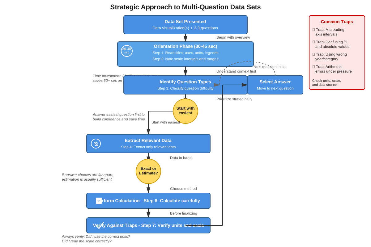
Initial Approach: When encountering a data interpretation set, invest 20-30 seconds in orientation before reading any questions. Identify: (1) What type(s) of display are shown, (2) What the axes/columns represent and their units, (3) What scale increments are used, (4) What the legend indicates, and (5) The general range of values. This upfront investment prevents repeated re-reading and reduces errors.
Trigger Words: Certain phrases indicate specific approaches:
- "Approximately" or "closest to" → estimation is acceptable and often preferred
- "Exactly" or "precisely" → careful calculation required
- "Greatest/least" → comparison focus; may not need exact values
- "Percent increase/decrease" → use percentage change formula
- "How many more/fewer" → calculate absolute difference
- "What fraction/proportion" → express as ratio or percentage of total
Process of Elimination: For data interpretation questions, wrong answers often result from predictable errors:
- Values that result from reading the wrong scale or using wrong units
- Answers that confuse percentage with absolute values
- Results from using the wrong data series or time period
- Calculations that use addition instead of multiplication (or vice versa)
- Values that represent intermediate steps rather than final answers
Identify which error each wrong answer represents to confirm your correct answer.
Time Management: Allocate approximately 2 minutes per question in a data interpretation set, but recognize that the first question often takes slightly longer (as you orient to the data) while subsequent questions may go faster (as you're already familiar with the display). If a question requires extensive calculation and you're running short on time, make an educated guess and move on—data interpretation questions aren't worth more points than other questions.
Verification Strategy: After calculating an answer, perform a quick reasonableness check. If you calculated that a company's revenue increased by 450%, verify this makes sense (it would mean revenue more than quintupled—is that consistent with the visual display?). Many errors can be caught by asking "Does this answer make sense given what I see in the graph?"
Memory Techniques
SCALE Acronym for systematic graph reading:
- Scale: Check the increment and units
- Categories: Identify what's being compared
- Axes: Read labels and verify what each represents
- Legend: Understand what colors/patterns mean
- Extract: Only then pull specific values
Percentage Change Mnemonic: "New Over Old, Minus One, Times 100" (NOOMT-100)
- Formula: (New/Old - 1) × 100, which equals (New - Old)/Old × 100
Visual Memory: Picture a pie chart as a pizza that must be completely consumed (100%). If someone eats 30% of the pizza, 70% remains—the pieces always sum to the whole. This prevents errors where students incorrectly add percentages beyond 100%.
Unit Conversion Reminder: "Thousands have Three zeros, Millions have Many (six) zeros, Billions have Bunches (nine) zeros" (TMB: 3-6-9)
Comparison Shortcut: For quick percentage calculations, remember "FRED":
- Fifty percent = half
- Round numbers (10%, 25%, 75%) = easy division
- Estimate when answers are spread
- Double-check which value is the base (denominator)
Summary
Data interpretation is a high-frequency, high-impact skill on the GRE Quantitative Reasoning section, appearing in approximately 25-30% of questions through sets of 2-3 questions sharing common data displays. Success requires three integrated competencies: accurate visual literacy (reading scales, axes, legends, and units correctly), efficient calculation (performing arithmetic operations with extracted values), and strategic thinking (knowing when to estimate versus calculate precisely, and recognizing common traps). The five primary display types—bar graphs, line graphs, pie charts, tables, and scatter plots—each have characteristic features and common pitfalls. Critical distinctions include absolute versus relative values, percentage change versus absolute change, and values from single versus multiple data sources. The most common errors stem from unit confusion, scale misreading, and confusing percentages with absolute values. Efficient test-takers invest time upfront in understanding the data display structure, identify relevant values before extracting numbers, use estimation when answer choices permit, and verify answers through reasonableness checks. Mastery of data interpretation requires both computational accuracy and analytical judgment, making it an excellent discriminator of quantitative reasoning ability.
Key Takeaways
- Data interpretation questions appear in sets sharing one display; invest time understanding the display structure before attempting questions
- Always verify units, scale increments, and axis labels before extracting any values—unit confusion is the single most common error source
- Distinguish clearly between absolute values and percentages, and between absolute change and percent change—these are different measures that often lead to different answers
- Use strategic estimation when answer choices are widely spaced; precise calculation wastes time without improving accuracy
- Pie charts show only relative proportions (percentages of a whole), never absolute values unless the total is explicitly provided
- The SCALE approach (Scale, Categories, Axes, Legend, Extract) provides a systematic method for approaching any data display
- Common wrong answers result from predictable errors: wrong units, wrong data series, percentage/absolute confusion, or intermediate calculation steps
Related Topics
Statistical Measures: Building on data interpretation, statistical measures (mean, median, mode, range, standard deviation) provide tools for summarizing and analyzing data distributions. Mastery of data interpretation enables understanding how these measures relate to visual data displays.
Probability from Data: Many GRE questions combine data interpretation with probability, asking for the likelihood of selecting items with certain characteristics from displayed data. Strong data interpretation skills make these hybrid questions more manageable.
Rate and Work Problems with Data: Some advanced questions present rate or work information in tabular or graphical form, requiring both data extraction and application of rate formulas. Data interpretation mastery is prerequisite for these complex problems.
Coordinate Geometry: Scatter plots and line graphs connect to coordinate geometry concepts, as points on these displays represent (x, y) coordinates. Understanding data interpretation facilitates learning about slopes, intercepts, and linear relationships.
Practice CTA
Now that you've mastered the core concepts of data interpretation, it's time to solidify your skills through deliberate practice. Attempt the practice questions associated with this topic, focusing on applying the SCALE approach and distinguishing between absolute and relative values. Use the flashcards to reinforce high-yield facts and common formulas. Remember: data interpretation rewards systematic thinking and attention to detail—skills that improve rapidly with focused practice. Each question you work through builds pattern recognition that will serve you on test day. You've built the foundation; now construct mastery through application!
Sign up free to keep reading
Create a free AnvayaPrep account to finish this GRE guide on Data interpretation — plus flashcards and practice questions.