Overview
Bar graphs are one of the most frequently tested data interpretation formats on the GRE Quantitative Reasoning section. These visual representations display categorical data using rectangular bars whose lengths or heights correspond to the values they represent. Mastering bar graphs is essential because they appear in approximately 15-20% of all Quantitative Reasoning questions, often combined with other data interpretation formats or embedded within multi-part question sets.
The GRE uses gre bar graphs to assess multiple quantitative skills simultaneously: reading and interpreting visual data, performing calculations with extracted values, comparing quantities across categories, and making inferences based on presented information. Unlike simple arithmetic problems, bar graph questions test a student's ability to quickly extract relevant information from visual displays, identify relationships between data points, and perform accurate calculations under time pressure. These questions frequently integrate concepts from percentages, ratios, averages, and estimation—making bar graph proficiency a gateway skill for success across the entire Data Analysis unit.
Understanding bar graphs connects directly to broader Quantitative Reasoning competencies including data interpretation, analytical reasoning, and quantitative comparison. The skills developed through bar graph mastery—such as rapid data extraction, visual pattern recognition, and multi-step problem solving—transfer directly to other graphical formats including line graphs, pie charts, and scatterplots. Additionally, bar graph questions often serve as the foundation for more complex data interpretation sets that combine multiple visual formats, making this topic a critical building block for achieving competitive GRE scores.
Learning Objectives
- [ ] Identify when Bar graphs is being tested
- [ ] Explain the core rule or strategy behind Bar graphs
- [ ] Apply Bar graphs to GRE-style questions accurately
- [ ] Extract precise numerical values from bar graphs with varying scales and formats
- [ ] Calculate percentages, ratios, and differences using data from multiple bars or categories
- [ ] Recognize common bar graph variations (grouped, stacked, horizontal) and adjust interpretation strategies accordingly
- [ ] Identify misleading visual elements in bar graphs that could lead to calculation errors
Prerequisites
- Basic arithmetic operations: Essential for performing calculations with values extracted from bar graphs, including addition, subtraction, multiplication, and division
- Percentage calculations: Required for determining percent increase/decrease, percent of total, and comparative percentages between categories
- Ratio and proportion concepts: Necessary for comparing relative values between different bars and establishing relationships between categories
- Scale reading and estimation: Fundamental for accurately extracting values when bars fall between gridlines or when precise values aren't labeled
- Average (mean) calculation: Frequently needed when questions ask about average values across multiple categories shown in bar graphs
Why This Topic Matters
Bar graphs represent one of the most practical and universally applicable data visualization methods in professional, academic, and everyday contexts. In business settings, bar graphs display sales figures, market share comparisons, and performance metrics. In scientific research, they illustrate experimental results, population distributions, and comparative analyses. The ability to rapidly interpret bar graphs is a fundamental literacy skill that extends far beyond standardized testing into graduate-level coursework and professional careers.
On the GRE specifically, bar graph questions appear with high frequency—typically 2-4 questions per Quantitative Reasoning section. These questions commonly appear in the Data Interpretation question sets, which present 2-3 related questions based on the same graphical display. Bar graphs may appear alone or combined with tables, line graphs, or other visual formats in these sets. The ETS (Educational Testing Service) favors bar graphs because they efficiently test multiple competencies: visual interpretation, numerical reasoning, and analytical thinking.
Common GRE bar graph scenarios include: comparing sales or revenue across different years or regions, analyzing demographic data across population groups, displaying survey results across multiple response categories, showing production or performance metrics across different entities, and presenting financial data such as budgets or expenditures across departments or time periods. Questions typically ask students to calculate specific values, determine percent changes, identify maximum or minimum values, compare ratios between categories, or make inferences about trends and relationships within the data.
Core Concepts
Structure and Components of Bar Graphs
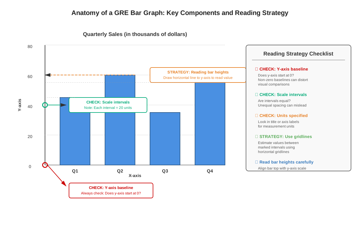
A bar graph (also called a bar chart) consists of several essential components that must be understood for accurate interpretation. The axes form the foundation: the horizontal axis (x-axis) typically displays categories or groups being compared, while the vertical axis (y-axis) shows the quantitative scale representing the measured values. However, horizontal bar graphs reverse this orientation, with categories on the vertical axis and values on the horizontal axis.
The bars themselves are rectangular shapes whose length (or height) corresponds proportionally to the value they represent. The scale on the value axis determines how to read these measurements—this is critical because GRE questions often use scales that don't begin at zero or use intervals that require careful attention (such as increments of 50, 250, or 1,000). The title provides context about what data is being displayed, while axis labels identify what each axis represents. Many bar graphs include a legend or key when displaying multiple data series within the same graph.
Types of Bar Graphs on the GRE
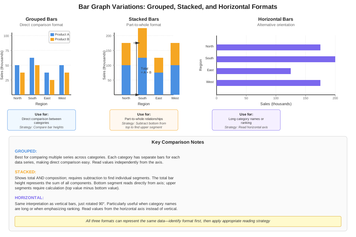
Simple bar graphs display a single data series with one bar per category. For example, a graph showing annual revenue for five different years would have five bars, each representing one year's revenue. These are the most straightforward to interpret and typically appear in easier questions or as part of multi-graph data interpretation sets.
Grouped bar graphs (also called clustered bar graphs) display multiple data series side-by-side for each category. For instance, a graph comparing sales of three products across four quarters would show three bars grouped together for each quarter, with different colors or patterns distinguishing each product. These require careful attention to the legend and precise identification of which bar corresponds to which data series.
Stacked bar graphs display multiple data series by dividing each bar into segments, with each segment representing a component of the total. The total height of each bar represents the sum of all components. For example, a graph showing total company expenses might stack bars with segments for salaries, rent, supplies, and marketing. Reading stacked bar graphs requires understanding that individual segment values are found by calculating differences between the boundaries of each segment.
Reading Values from Bar Graphs
Accurate value extraction is the fundamental skill for all bar graph questions. When a bar aligns exactly with a gridline, simply read the value from the scale. When bars fall between gridlines, estimation becomes necessary. Calculate the interval between gridlines, determine what fraction of that interval the bar extends beyond the lower gridline, and add that fractional amount to the lower gridline value.
For example, if gridlines are marked at 200 and 300, and a bar extends approximately three-fifths of the way between them, the interval is 100, three-fifths of 100 is 60, so the bar represents approximately 260. The GRE often designs answer choices to be sufficiently spaced that precise estimation to the nearest reasonable unit is adequate—perfect precision is rarely required.
Common Calculations with Bar Graph Data
Difference calculations involve subtracting one bar's value from another. Questions might ask "How much greater was revenue in 2020 than in 2018?" requiring extraction of both values and subtraction.
Percent change calculations follow the formula: (New Value - Old Value) / Old Value × 100%. These questions often ask about percent increase or decrease between categories or time periods.
Ratio calculations compare two values by division. A question might ask "What is the ratio of Product A sales to Product B sales?" requiring extraction of both values and expressing them as a simplified ratio.
Average calculations require summing values from multiple bars and dividing by the number of bars. Questions like "What was the average quarterly revenue?" require adding all quarterly values and dividing by four.
Percentage of total calculations require finding what percent one category represents of the sum of all categories. This involves adding all bar values to find the total, then dividing the specific category value by that total and multiplying by 100%.
Scale Considerations and Visual Tricks
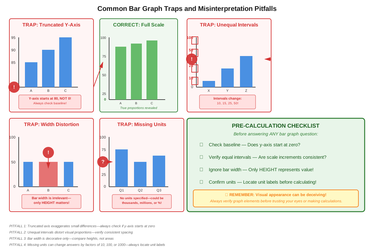
The GRE frequently employs non-zero baselines where the value axis doesn't start at zero. This visually exaggerates differences between bars, making small actual differences appear dramatic. Always check where the scale begins before making comparisons.
Irregular intervals use inconsistent spacing on the value axis (such as 0, 10, 25, 50, 100) which can distort visual perception of differences. Always read the actual scale values rather than relying on visual bar height comparisons.
Dual-scale graphs occasionally appear, with different scales for different data series. These require careful attention to which bars correspond to which scale, typically indicated by the legend.
Multi-Step Problem Solving with Bar Graphs
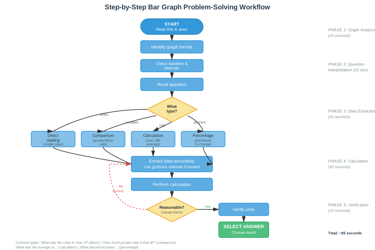
Complex GRE questions often require extracting multiple values and performing sequential calculations. A systematic approach is essential:
- Read the question completely to understand what is being asked
- Identify all data points needed from the graph
- Extract each value carefully, noting units and scale
- Perform calculations in logical sequence
- Check that the answer makes sense in context
- Verify the answer matches the units requested in the question
Concept Relationships
Bar graph interpretation skills build directly upon fundamental arithmetic operations and percentage calculations. The ability to read scales and estimate values connects to number sense and proportional reasoning. When extracting data from bar graphs, students apply their understanding of place value and decimal notation to interpret scales correctly.
The relationship flow follows this pattern: Scale Reading → enables → Value Extraction → enables → Arithmetic Operations → produces → Calculated Results → which support → Comparative Analysis and Inference Making. Each step depends on accuracy in the previous step, making systematic approaches essential.
Bar graphs connect horizontally to other data interpretation formats. Skills mastered with bar graphs transfer directly to line graphs (reading values from visual displays), pie charts (calculating percentages and proportions), and tables (organizing and comparing categorical data). Many GRE data interpretation sets combine bar graphs with these other formats, requiring students to extract data from multiple sources and integrate information.
Within the broader Data Analysis unit, bar graph questions often incorporate concepts from descriptive statistics (mean, median, range), probability (when bars represent frequencies or counts), and data inference (drawing conclusions from presented data). The visual interpretation skills developed through bar graph practice enhance performance on quantitative comparison questions that present data visually.
Quick check — test yourself on Bar graphs so far.
Try Flashcards →High-Yield Facts
- ⭐ Always check the scale on the value axis before extracting any numbers—non-zero baselines and irregular intervals are common GRE tricks
- ⭐ In grouped bar graphs, the legend is essential for identifying which bar corresponds to which data series
- ⭐ When calculating percent change, the denominator is always the original (earlier) value, not the new value
- ⭐ Stacked bar graphs require subtraction to find individual segment values—the segment value equals the upper boundary minus the lower boundary
- ⭐ Answer choices are typically spaced to accommodate reasonable estimation—perfect precision when reading between gridlines is rarely necessary
- Bar graph questions often ask for "approximately" values, signaling that estimation is acceptable and expected
- The units shown on the axis label (thousands, millions, percentages) must be incorporated into final answers
- Horizontal bar graphs follow the same interpretation principles as vertical bar graphs, just with rotated orientation
- When multiple calculations are required, write down intermediate values to avoid arithmetic errors
- Questions asking for "the difference between the greatest and least values" require identifying maximum and minimum bars first
- Percent of total calculations require summing all relevant bars before dividing the specific category by that total
- Visual bar height can be deceiving—always read actual scale values rather than comparing bars by appearance alone
- Time-series bar graphs (showing data across years or quarters) often test percent change calculations
- Questions may ask about data not explicitly shown, requiring calculations like "the average of the two middle years"
- When bars are very close in height, precise reading of the scale becomes especially important for determining which is greater
Common Misconceptions
Misconception: The tallest bar always represents the largest value in any bar graph.
Correction: While this is true for standard bar graphs with zero baselines, graphs with non-zero baselines or truncated scales can make smaller actual differences appear visually dramatic. Always read the scale values rather than relying on visual height comparisons.
Misconception: In stacked bar graphs, each segment's value can be read directly from the scale.
Correction: Only the bottom segment of a stacked bar can be read directly from the scale. All other segments require subtraction—the segment value equals the height of the upper boundary minus the height of the lower boundary. For example, if a segment's lower boundary is at 300 and upper boundary is at 475, the segment represents 175, not 475.
Misconception: When calculating percent change, you can use either value as the denominator.
Correction: Percent change always uses the original (earlier or baseline) value as the denominator. The formula is (New - Old) / Old × 100%. Using the wrong denominator produces an incorrect percentage and is a common trap in answer choices.
Misconception: If a bar falls halfway between two gridlines, its value is the average of those gridlines.
Correction: This is only true if the scale uses equal intervals. Always verify the interval size between consecutive gridlines. If gridlines show 0, 50, 150, 300, the intervals are not equal, and the midpoint between 50 and 150 is 100, not 125.
Misconception: In grouped bar graphs, bars of the same color always represent the same category across all groups.
Correction: While this is typically true, always verify by checking the legend. Some graphs use position rather than color to distinguish data series, and the legend is the authoritative source for bar identification.
Misconception: The scale intervals must be consistent throughout the entire axis.
Correction: The GRE occasionally uses graphs with irregular intervals (such as 0, 10, 25, 50, 100, 200) to test careful reading. Always check each interval rather than assuming consistency.
Misconception: When a question asks for an "approximate" value, any rough estimate is acceptable.
Correction: "Approximate" signals that perfect precision isn't required, but estimates should still be reasonably accurate—typically within 5-10% of the actual value. The answer choices will be spaced to distinguish between careful estimation and careless reading.
Worked Examples
Example 1: Multi-Step Calculation with Grouped Bar Graph
Problem: A grouped bar graph shows quarterly sales (in thousands of dollars) for three products over four quarters. Product A's sales were: Q1: 240, Q2: 280, Q3: 310, Q4: 290. Product B's sales were: Q1: 180, Q2: 220, Q3: 260, Q4: 300. What was the percent increase in Product B's average quarterly sales compared to Product A's average quarterly sales?
Solution:
Step 1: Calculate Product A's average quarterly sales.
Sum = 240 + 280 + 310 + 290 = 1,120
Average = 1,120 ÷ 4 = 280 thousand dollars
Step 2: Calculate Product B's average quarterly sales.
Sum = 180 + 220 + 260 + 300 = 960
Average = 960 ÷ 4 = 240 thousand dollars
Step 3: Determine the relationship requested.
The question asks for the percent increase in Product B compared to Product A. However, Product B's average (240) is actually less than Product A's average (280), so there is no increase. This is a trap—the question assumes Product B is higher.
Step 4: Reconsider the question.
If the question asks "What was the percent increase in Product B's average quarterly sales compared to Product A's average quarterly sales?" and Product B is lower, the answer would be that there was no increase, but rather a decrease. However, if we calculate the percent difference:
Product B is what percent of Product A?
240 / 280 = 0.857 = 85.7%
Product B is approximately 14.3% less than Product A, not greater.
Key Takeaway: This example demonstrates the importance of carefully reading what the question asks and verifying that the requested calculation makes sense with the data. Always check whether the comparison goes in the expected direction.
Example 2: Stacked Bar Graph with Percentage Calculation
Problem: A stacked bar graph shows company expenses for three years. In 2021, the bar shows total expenses of 800 thousand dollars, with segments for: Salaries (bottom to 450), Rent (450 to 600), Supplies (600 to 700), and Marketing (700 to 800). What percentage of 2021 total expenses was spent on Rent and Supplies combined?
Solution:
Step 1: Identify the total expenses.
Total = 800 thousand dollars (the top of the entire stacked bar)
Step 2: Calculate the Rent segment value.
Rent segment extends from 450 to 600
Rent = 600 - 450 = 150 thousand dollars
Step 3: Calculate the Supplies segment value.
Supplies segment extends from 600 to 700
Supplies = 700 - 600 = 100 thousand dollars
Step 4: Find the combined amount for Rent and Supplies.
Combined = 150 + 100 = 250 thousand dollars
Step 5: Calculate the percentage of total.
Percentage = (250 / 800) × 100% = 0.3125 × 100% = 31.25%
Answer: Rent and Supplies combined represented 31.25% of total 2021 expenses.
Key Takeaway: In stacked bar graphs, segment values require subtraction of boundaries. Never read a segment's upper boundary as its value. Always identify the total (top of the entire bar) when calculating percentages of total.
Exam Strategy
When approaching GRE bar graph questions, begin by investing 10-15 seconds to thoroughly examine the graph before reading the question. Identify the title, axis labels, scale intervals, units, and legend (if present). Check specifically whether the value axis starts at zero and whether intervals are consistent. This upfront investment prevents misreading errors that waste time later.
Trigger words that signal specific calculation types include: "approximately" (estimation is acceptable), "percent increase/decrease" (use percent change formula), "ratio of X to Y" (division required), "average" (sum and divide), "difference between" (subtraction), "total" (addition), and "what percent of" (division and multiplication by 100).
For process of elimination, calculate the approximate magnitude of the answer before looking at choices. If you're finding the difference between bars at approximately 450 and 280, you know the answer should be around 170. Immediately eliminate choices like 45, 730, or 1,600 that are wrong by orders of magnitude. This prevents calculation errors from leading to incorrect answers when the wrong answer appears among the choices.
Time allocation for bar graph questions should be approximately 1.5-2 minutes per question. Simple extraction questions (identifying a single value or comparing two bars) should take 60-90 seconds. Multi-step calculation questions requiring multiple extractions and operations may take 2-2.5 minutes. If a question requires more than 3 minutes, mark it for review and move on—you may be making it more complicated than necessary.
When questions present multiple bar graphs or combine bar graphs with other data formats, read all questions in the set before beginning calculations. Sometimes later questions provide information or context that helps answer earlier questions more efficiently. Additionally, calculations performed for one question may be reusable for subsequent questions in the set.
For grouped bar graphs, use your finger or pencil to trace from the specific bar up to the scale, ensuring you're reading the correct bar among the cluster. For stacked bar graphs, mark the boundary values on your scratch paper before calculating segment values to avoid arithmetic errors.
Memory Techniques
SCALE - A mnemonic for the systematic approach to bar graph questions:
- Study the graph structure (axes, labels, legend, units)
- Check the scale (starting point, intervals, consistency)
- Analyze what the question asks
- Locate all needed data points
- Execute calculations systematically
"Bottom-Up Subtraction" - For stacked bar graphs, remember that you always subtract the bottom boundary from the top boundary to find a segment's value. Visualize peeling off the lower segments to reveal the segment you need.
"Old on the Bottom" - For percent change calculations, remember that the original (old) value always goes in the denominator. Visualize a fraction with "OLD" written on the bottom line.
The "Zero Check" - Before reading any values, visualize a bright red circle around the origin of the value axis. This forces you to check whether the scale starts at zero or some other value, preventing the most common bar graph error.
"Legend First, Bars Second" - For grouped bar graphs, train yourself to look at the legend before looking at any bars. This prevents misidentifying which bar represents which data series.
Summary
Bar graphs are high-frequency, high-value question types on the GRE Quantitative Reasoning section, appearing in approximately 15-20% of questions and often in multi-question data interpretation sets. Mastery requires understanding the structural components (axes, scales, bars, legends), recognizing different formats (simple, grouped, stacked, horizontal), and executing accurate value extraction even when bars fall between gridlines. The most critical skills are checking scale properties before reading values, performing multi-step calculations systematically, and avoiding common traps like non-zero baselines and incorrect percent change formulas. Success with bar graphs requires both visual interpretation skills and computational accuracy, making them an integration point for multiple quantitative competencies. Students who master bar graph interpretation gain advantages not only on direct bar graph questions but also on complex data interpretation sets that combine multiple visual formats, making this topic essential for achieving competitive GRE scores.
Key Takeaways
- Always examine the scale carefully before extracting any values—check the starting point, intervals, and units
- In stacked bar graphs, segment values require subtraction of the lower boundary from the upper boundary
- Percent change calculations always use the original (earlier) value as the denominator: (New - Old) / Old × 100%
- Grouped bar graphs require careful attention to the legend to identify which bar corresponds to which data series
- Answer choices are typically spaced to accommodate reasonable estimation—perfect precision is rarely necessary
- Multi-step problems require systematic approaches: identify all needed values, extract carefully, calculate sequentially, and verify the answer makes sense
- Visual bar height can be deceiving when scales don't start at zero—always read actual scale values rather than comparing by appearance
Related Topics
Line Graphs: Building on bar graph interpretation skills, line graphs display continuous data over time and require understanding trends, slopes, and rates of change. Mastering bar graphs provides the foundation for extracting values from visual displays, which transfers directly to reading points on line graphs.
Pie Charts: These circular graphs display parts of a whole using sectors, requiring percentage and proportion calculations similar to those used with bar graphs. The skill of calculating "percentage of total" developed through bar graph practice applies directly to pie chart interpretation.
Tables and Data Interpretation Sets: Many GRE questions combine bar graphs with tables or other visual formats, requiring integration of information from multiple sources. Strong bar graph skills enable efficient navigation of these complex question sets.
Scatterplots: These graphs display relationships between two variables using individual data points, requiring interpretation of patterns and trends. The visual interpretation skills developed through bar graph mastery transfer to recognizing patterns in scatterplots.
Descriptive Statistics: Bar graphs often display data that requires calculating means, medians, ranges, and other statistical measures. Mastering bar graph value extraction enables efficient application of statistical concepts to visual data.
Practice CTA
Now that you've mastered the core concepts, strategies, and common pitfalls of bar graph interpretation, it's time to solidify your skills through deliberate practice. Attempt the practice questions associated with this topic, focusing on applying the systematic approaches outlined in this guide. Use the flashcards to reinforce high-yield facts and formulas until they become automatic. Remember that bar graph mastery isn't just about getting questions correct—it's about developing the speed and confidence to handle these questions efficiently under test conditions, freeing up valuable time for more challenging problems. Your investment in mastering this high-frequency topic will pay dividends across multiple questions on test day. Start practicing now, and track your improvement as you build toward your target score!
Sign up free to keep reading
Create a free AnvayaPrep account to finish this GRE guide on Bar graphs — plus flashcards and practice questions.