Overview
Line graphs are one of the most frequently tested data interpretation formats on the GRE Quantitative Reasoning section. These visual representations display quantitative information by connecting data points with line segments, making them ideal for showing trends, changes over time, and relationships between variables. On the GRE, GRE line graphs typically appear in the Data Analysis questions, where test-takers must extract numerical information, calculate rates of change, compare values across different time periods, and draw conclusions from visual data.
Mastering line graphs is essential for GRE success because they appear in approximately 15-20% of all Quantitative Reasoning questions, often in multi-part question sets where a single graph supports 2-3 questions. The GRE uses line graphs to test not just reading comprehension of visual data, but also mathematical reasoning, estimation skills, and the ability to synthesize information quickly under time pressure. Unlike simple arithmetic problems, line graph questions require students to integrate multiple skills: identifying relevant data points, performing calculations with extracted values, understanding scale and units, and recognizing patterns or anomalies in the data.
Within the broader context of Quantitative Reasoning, line graphs connect directly to concepts in statistics, percentages, ratios, rates of change, and algebraic reasoning. They serve as a bridge between pure computation and applied problem-solving, requiring students to translate visual information into mathematical operations. Understanding line graphs also builds foundational skills for interpreting other data visualization formats tested on the GRE, including bar graphs, pie charts, and scatter plots.
Learning Objectives
- [ ] Identify when Line graphs is being tested
- [ ] Explain the core rule or strategy behind Line graphs
- [ ] Apply Line graphs to GRE-style questions accurately
- [ ] Extract precise numerical values from line graphs with varying scales and units
- [ ] Calculate rates of change, percentage increases/decreases, and averages from line graph data
- [ ] Distinguish between absolute values and relative changes when interpreting trends
- [ ] Recognize common distortions and misleading visual elements in line graph presentations
Prerequisites
- Basic arithmetic operations: Essential for performing calculations with values extracted from line graphs, including addition, subtraction, multiplication, and division
- Understanding of coordinate systems: Necessary to locate points on the x-axis (typically time or categories) and y-axis (typically quantities or measurements)
- Percentage calculations: Required for computing percentage change, percentage increase/decrease, and comparing relative magnitudes
- Ratio and proportion concepts: Needed to understand relationships between different data series and scale interpretations
- Basic statistics terminology: Familiarity with terms like average, median, range, and trend helps interpret graph patterns
Why This Topic Matters
Line graphs appear throughout professional, academic, and everyday contexts. Scientists use them to display experimental results over time, economists track market trends and economic indicators, healthcare professionals monitor patient vital signs, and business analysts present sales performance data. The ability to quickly interpret line graphs is a fundamental quantitative literacy skill that extends far beyond standardized testing.
On the GRE specifically, line graphs appear in approximately 3-5 questions per test administration, making them one of the highest-yield data interpretation topics. They typically appear as part of the Data Interpretation question sets, where a single graph or set of graphs is followed by 2-3 questions of varying difficulty. The GRE favors line graphs because they efficiently test multiple competencies: numerical reasoning, attention to detail, estimation skills, and the ability to work under time constraints.
Common GRE presentations include: single-line graphs showing one variable over time; multiple-line graphs comparing two or more variables simultaneously; line graphs with dual y-axes showing different scales; graphs requiring interpolation between marked points; and graphs where the answer requires combining information from multiple data points. The test frequently includes questions asking for percentage changes between non-consecutive years, comparisons of rates of change across different time periods, and identification of maximum/minimum values or turning points in trends.
Core Concepts
Anatomy of a Line Graph
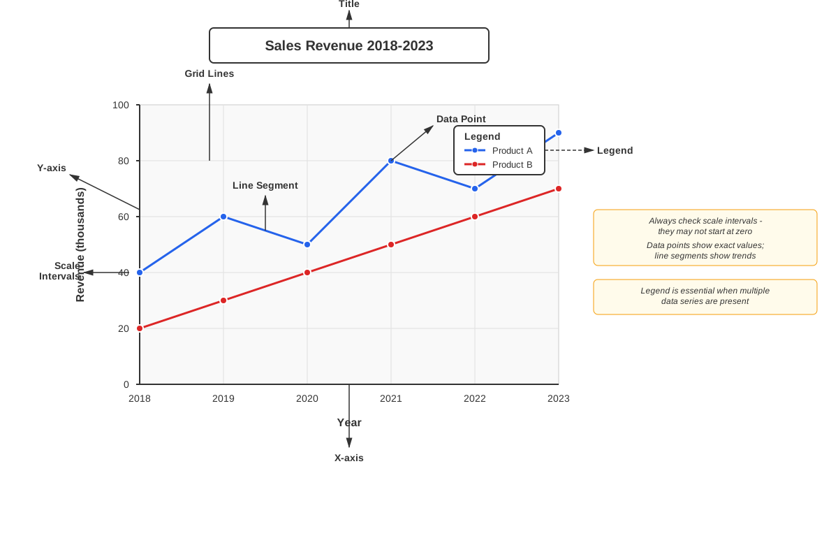
A line graph consists of several essential components that must be identified before attempting any calculations. The x-axis (horizontal axis) typically represents the independent variable, most commonly time periods such as years, months, or quarters. The y-axis (vertical axis) represents the dependent variable—the quantity being measured, such as sales figures, population counts, or test scores. Each data point marks a specific value at a particular x-coordinate, and these points are connected by line segments to show the progression or trend.
The scale of each axis is critical for accurate interpretation. GRE line graphs often use non-uniform scales or scales that don't begin at zero, which can visually exaggerate or minimize changes. The legend or key identifies what each line represents when multiple data series appear on the same graph. Grid lines help estimate values between marked intervals, though GRE questions are designed so that precise reading of intermediate values is usually unnecessary.
Reading Values from Line Graphs
Extracting accurate values requires systematic attention to scale markings. First, identify the unit of measurement and any multipliers indicated (such as "in thousands" or "in millions"). Second, locate the relevant data point by finding the correct x-coordinate, then tracing vertically to where it intersects the line. Third, trace horizontally from that intersection point to the y-axis to read the value.
When a data point falls between marked scale intervals, estimation becomes necessary. If the y-axis shows intervals of 10 (e.g., 0, 10, 20, 30), and a point appears halfway between 20 and 30, the value is approximately 25. The GRE typically designs questions so that either the point falls exactly on a grid line, or the answer choices are sufficiently spread apart that reasonable estimation yields the correct answer.
Calculating Changes and Trends
Absolute change represents the simple difference between two values: Final Value - Initial Value. If sales were 40 units in Year 1 and 65 units in Year 3, the absolute change is 65 - 40 = 25 units. This calculation is straightforward but doesn't account for the magnitude of the original value.
Percentage change provides relative context and is calculated as:
Percentage Change = ((Final Value - Initial Value) / Initial Value) × 100%Using the previous example: ((65 - 40) / 40) × 100% = (25/40) × 100% = 62.5% increase. The GRE frequently tests whether students can distinguish between absolute and percentage changes, as these can lead to very different conclusions about the data.
Rate of change describes how quickly a variable changes over time. The average rate of change between two points equals the absolute change divided by the time interval. If sales increased from 40 to 65 units over 3 years, the average rate of change is 25 units / 3 years ≈ 8.33 units per year. The slope of a line segment connecting two points represents this rate of change visually—steeper slopes indicate faster rates of change.
Multiple-Line Graphs
When a line graph displays multiple data series, each line typically represents a different category, group, or variable. The legend identifies each line, often through different colors, line styles (solid, dashed, dotted), or markers (circles, squares, triangles). These graphs enable comparison between different series at the same time point or tracking how the relationship between variables changes over time.
Common GRE questions on multiple-line graphs include: identifying which series had the greatest value at a specific time; determining when two series were equal; calculating the difference between two series at a given point; and finding which series showed the greatest rate of increase over a period.
Interpreting Trends and Patterns
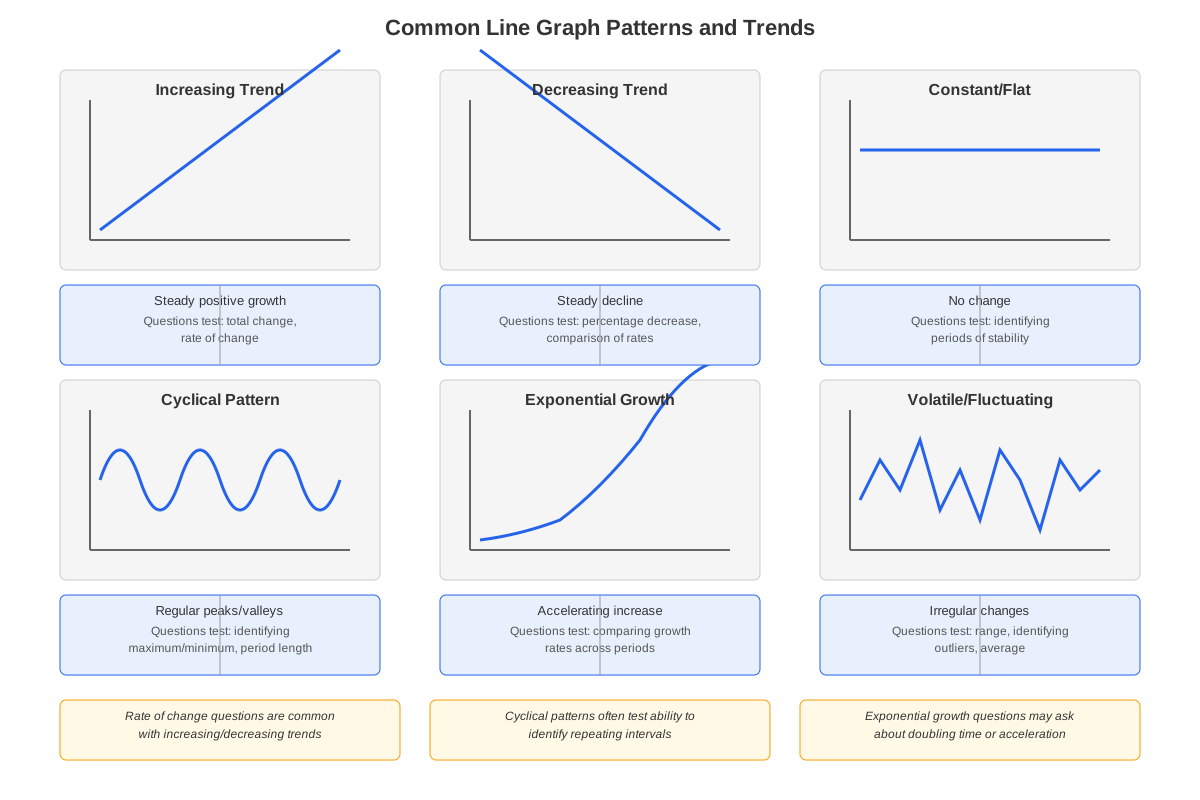
A trend describes the general direction of data over time. An increasing trend shows values generally rising, a decreasing trend shows values falling, and a constant trend shows relatively stable values. Trends can be linear (changing at a constant rate, appearing as a straight line) or non-linear (changing at varying rates, appearing as a curved line).
Peaks represent local maximum values where the line changes from increasing to decreasing. Troughs represent local minimum values where the line changes from decreasing to increasing. Inflection points mark where the rate of change shifts—for example, where growth accelerates or decelerates. Identifying these features helps answer questions about when values were highest, lowest, or changing most rapidly.
Scale Manipulation and Visual Distortion
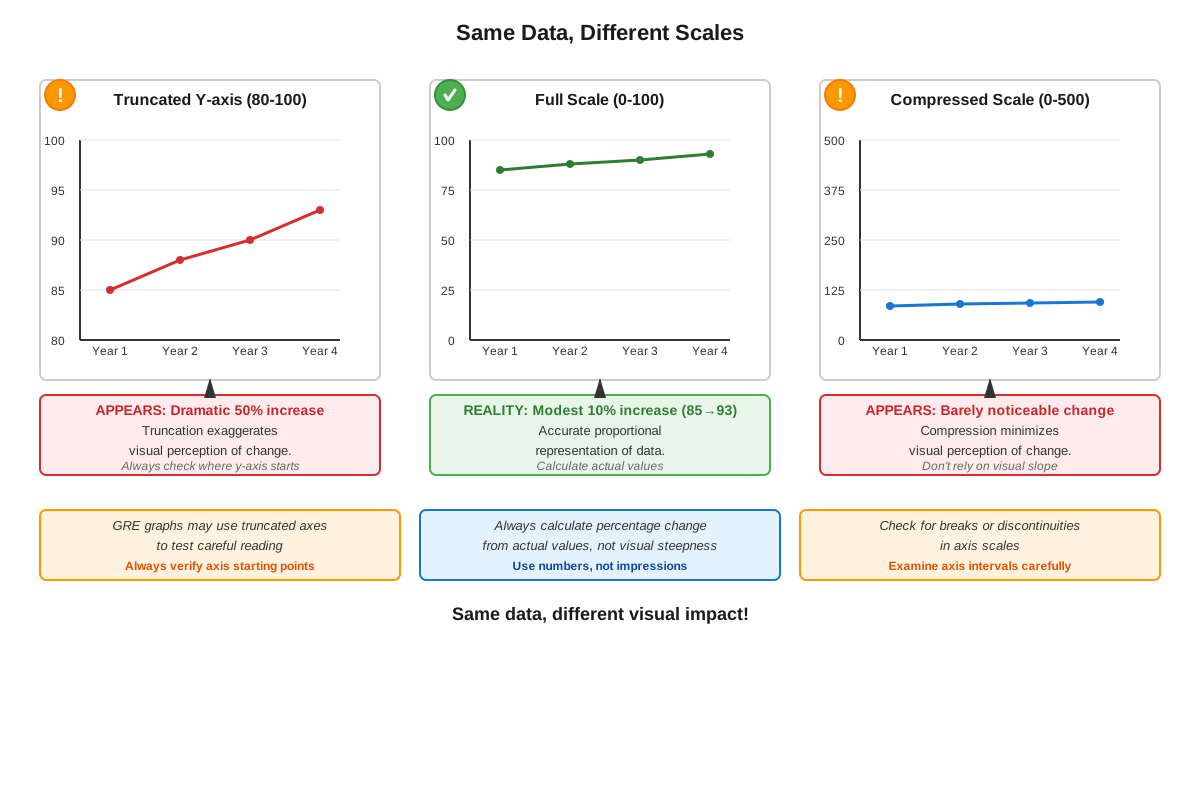
The GRE occasionally presents line graphs with truncated y-axes that don't start at zero, making changes appear more dramatic than they actually are. A sales increase from 95 to 100 units appears as a massive spike if the y-axis runs from 90 to 100, but would look minimal on a scale from 0 to 100. Always check where the y-axis begins.
Dual y-axes graphs show two different scales—one on the left y-axis and another on the right y-axis—allowing comparison of variables with different units or magnitudes. These require careful attention to which line corresponds to which axis. The GRE uses these to test whether students can avoid incorrectly comparing values from different scales.
Concept Relationships
The core concepts within line graphs build upon each other hierarchically. Understanding the anatomy of a line graph → enables accurate reading of values → which allows calculation of changes and trends → leading to interpretation of patterns and meaningful conclusions. Each skill depends on mastering the previous one.
Multiple-line graphs extend single-line graph concepts by adding comparison and relationship analysis. The same skills for reading values and calculating changes apply, but with the additional complexity of tracking multiple data series simultaneously and understanding their interactions.
Scale manipulation awareness acts as a quality control layer over all other skills, ensuring that visual impressions don't override careful numerical analysis. This connects to the prerequisite knowledge of coordinate systems and reinforces the importance of systematic, methodical data extraction rather than relying on visual intuition.
Line graphs connect to other Data Analysis topics through shared analytical skills. The percentage change calculations used in line graphs apply equally to bar graphs and tables. The trend analysis skills transfer to scatter plots when examining correlations. The attention to scale and units required for line graphs prepares students for the precision needed in all quantitative data interpretation.
High-Yield Facts
- ⭐ Always check the scale and units on both axes before extracting any values—GRE graphs frequently use multipliers like "in thousands" or "in millions"
- ⭐ Percentage change and absolute change are different calculations that can lead to opposite conclusions about which change is "greater"
- ⭐ When comparing rates of change, look at the slope (steepness) of line segments—steeper means faster change
- ⭐ The highest point on a line graph represents the maximum value, but not necessarily the greatest rate of increase
- ⭐ On multiple-line graphs, carefully match each line to its legend before making any comparisons
- Grid lines are guides for estimation; if a point falls between lines, reasonable approximation is expected
- A line graph showing "percentage" on the y-axis displays percentages directly—no additional percentage calculation is needed
- When a question asks about "the year with the greatest increase," calculate the change for each relevant year rather than relying on visual impression
- Dual y-axis graphs require checking which axis corresponds to which line for every single comparison
- If the y-axis doesn't start at zero, visual changes appear exaggerated compared to the actual numerical changes
- Questions asking for averages over multiple years require summing all relevant values and dividing by the number of data points
- The point where two lines intersect represents when those two variables had equal values
Quick check — test yourself on Line graphs so far.
Try Flashcards →Common Misconceptions
Misconception: The steepest line segment always represents the largest absolute change.
Correction: Steepness represents rate of change per unit time. A steep segment over 1 year might show a smaller absolute change than a gradual segment over 10 years. Always calculate the actual difference rather than relying on visual slope.
Misconception: If Line A is always above Line B on a graph, then Line A is increasing faster than Line B.
Correction: Position (which line is higher) indicates which has greater absolute values at each point. Rate of increase is determined by slope—Line B could be increasing faster (steeper slope) while still remaining below Line A.
Misconception: When the y-axis shows values "in thousands," multiply the displayed value by 1,000 only for final answers.
Correction: Convert all values immediately upon extraction. If the graph shows "20" and the axis says "in thousands," that represents 20,000. Use 20,000 in all calculations, not 20.
Misconception: A line graph showing a flat (horizontal) segment means no data was collected for that period.
Correction: A horizontal segment indicates the value remained constant during that period—the variable didn't change, which is itself meaningful data.
Misconception: The percentage change between two points can be calculated by subtracting the percentages if the y-axis shows percentages.
Correction: If the y-axis displays percentages (e.g., "Market Share %"), those are the actual values. To find percentage change in market share, use the percentage change formula with those percentage values as inputs. If market share went from 20% to 25%, the absolute change is 5 percentage points, but the percentage change is (25-20)/20 × 100% = 25% increase.
Misconception: When estimating values between grid lines, always round to the nearest marked value.
Correction: Estimate proportionally based on position. If a point is three-quarters of the way between 40 and 50, estimate 47 or 48, not 50. The GRE designs answer choices to reward accurate estimation.
Misconception: If a line graph shows data for Years 1-5, and Year 3 is missing, you can assume Year 3's value by averaging Years 2 and 4.
Correction: Never assume or interpolate data unless the question explicitly instructs you to do so. If a data point is missing, it cannot be used in calculations unless the question provides additional information.
Worked Examples
Example 1: Single-Line Graph with Percentage Change
Problem: The line graph below shows the annual revenue (in millions of dollars) for Company X from 2015 to 2020.
Year    Revenue
2015    40
2016    45
2017    50
2018    55
2019    50
2020    60
Question: What was the approximate percentage increase in revenue from 2015 to 2020?
Solution:
Step 1: Identify the relevant values.
- Initial value (2015): 40 million dollars
- Final value (2020): 60 million dollars
Step 2: Calculate absolute change.
- Absolute change = 60 - 40 = 20 million dollars
Step 3: Apply percentage change formula.
- Percentage change = ((Final - Initial) / Initial) × 100%
- Percentage change = ((60 - 40) / 40) × 100%
- Percentage change = (20 / 40) × 100%
- Percentage change = 0.5 × 100% = 50%
Answer: The revenue increased by 50% from 2015 to 2020.
Key Learning Objective Addressed: This problem demonstrates applying line graphs to GRE-style questions accurately by extracting values and performing percentage change calculations, which is one of the most common question types.
Example 2: Multiple-Line Graph with Rate Comparison
Problem: A line graph displays monthly sales for Product A and Product B over six months (January through June).
Month       Product A    Product B
January     100          80
February    120          100
March       140          115
April       160          125
May         180          130
June        200          130
Question: During which two-month period did Product A show the greatest average rate of increase in sales?
Solution:
Step 1: Calculate the absolute change for each consecutive two-month period for Product A.
- Jan-Feb: 120 - 100 = 20
- Feb-Mar: 140 - 120 = 20
- Mar-Apr: 160 - 140 = 20
- Apr-May: 180 - 160 = 20
- May-Jun: 200 - 180 = 20
Step 2: Analyze the results.
All consecutive two-month periods show the same absolute increase of 20 units. Since the time intervals are equal (all are one month), the rate of increase is constant at 20 units per month.
Step 3: Consider non-consecutive periods if the question allows.
If the question asks about any two-month period (not necessarily consecutive):
- Jan-Mar (2 months): (140 - 100) / 2 = 40 / 2 = 20 per month
- Feb-Apr (2 months): (160 - 120) / 2 = 40 / 2 = 20 per month
The rate remains constant throughout.
Answer: All two-month periods show the same rate of increase (20 units per month) because Product A increases linearly. If forced to choose, any consecutive two-month period is equally correct.
Key Learning Objective Addressed: This problem illustrates the core strategy of calculating rates of change and demonstrates that visual steepness on a linear graph corresponds to constant rate of change. It also shows the importance of systematic calculation rather than visual estimation.
Exam Strategy
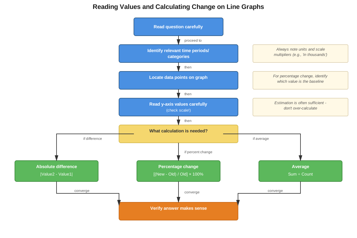
When approaching GRE line graph questions, follow this systematic process:
Step 1: Analyze the graph structure (15-20 seconds)
- Read the title and axis labels carefully
- Note the units and any multipliers (thousands, millions, percentages)
- Check where the y-axis begins (zero or truncated)
- Identify the legend if multiple lines are present
- Observe the overall trend before reading the question
Step 2: Read the question carefully (10 seconds)
- Identify exactly what is being asked (specific value, change, comparison, trend)
- Note the specific time period or data points referenced
- Determine whether the question asks for absolute values, changes, percentages, or rates
Step 3: Extract relevant data (20-30 seconds)
- Locate the specific data points needed
- Write down the values (including units) to avoid re-checking
- For multiple-line graphs, verify which line you're reading from
Step 4: Perform calculations (30-45 seconds)
- Use the extracted values in the appropriate formula
- For percentage change: ((Final - Initial) / Initial) × 100%
- For average: Sum of values / Number of values
- For rate of change: Change in value / Change in time
Step 5: Verify and select (10-15 seconds)
- Check that your answer makes logical sense
- Ensure units match the answer choices
- Confirm you answered the actual question asked
Trigger words and phrases to watch for:
- "Approximately" or "closest to" → estimation is acceptable; don't waste time on excessive precision
- "Greatest increase" → calculate actual changes; don't rely on visual steepness
- "Percentage" vs. "percent" vs. "percentage points" → these can have different meanings
- "Between Year X and Year Y" → clarify whether this means the change from X to Y or the years in between
- "Average" or "mean" → sum all relevant values and divide by count
Process-of-elimination tips:
- Eliminate answers that are impossible based on the scale (e.g., if the maximum value shown is 100, eliminate any answer suggesting a value over 100)
- For percentage change questions, eliminate answers that confuse absolute change with percentage change
- If comparing two quantities, eliminate answers that reverse the relationship
- For "greatest/least" questions, eliminate answers that are clearly not extreme values
Time allocation:
- Simple value extraction: 45-60 seconds
- Single calculation (percentage change, average): 60-90 seconds
- Complex multi-step problems: 90-120 seconds
- If a question exceeds 2 minutes, mark it and return if time permits
Exam Tip: On Data Interpretation sets with multiple questions about the same graph, answer the simpler questions first to build familiarity with the data, then tackle more complex questions. The time spent understanding the graph pays dividends across all questions in the set.
Memory Techniques
SCALE Acronym for Graph Analysis:
- Scale: Check both axes for units and starting points
- Compare: Identify what's being compared (time periods, categories, variables)
- Axes: Read labels carefully, noting any multipliers
- Legend: Match lines to their meanings before extracting data
- Extract: Pull specific values systematically, writing them down
Percentage Change Mnemonic: "FIN over IN"
Remember the percentage change formula as "FIN over IN times 100":
- FIN = Final minus Initial (numerator)
- IN = Initial (denominator)
- Formula: (FIN / IN) × 100%
Visualization Strategy for Rate of Change:
Picture yourself climbing a hill. A steeper slope means you're climbing faster (greater rate of change). A gentle slope means slower climbing (smaller rate of change). A horizontal line means you're walking on flat ground (zero rate of change). A downward slope means you're descending (negative rate of change).
"PEAK" for Maximum/Minimum Questions:
- Point: Locate the highest/lowest point on the line
- Exact: Read the exact value from the y-axis
- Adjacent: Check adjacent points to confirm it's truly the maximum/minimum
- Keep: Keep track of the x-coordinate (year, month, etc.) associated with that value
Multiple-Line Mantra:
"Legend first, line second, value third" — Always verify which line you're reading from before extracting any value, especially when lines cross or come close together.
Summary
Line graphs are essential data visualization tools that appear frequently on the GRE Quantitative Reasoning section, testing students' ability to extract information, perform calculations, and interpret trends. Mastery requires understanding the anatomy of line graphs (axes, scales, legends, data points), systematically extracting accurate values while accounting for units and multipliers, calculating absolute changes and percentage changes using proper formulas, comparing rates of change by analyzing slopes, and recognizing how scale manipulation can distort visual impressions. Success on GRE line graph questions depends on methodical analysis rather than visual intuition, careful attention to what the question actually asks, and efficient time management across multi-question data interpretation sets. Students must distinguish between absolute and relative changes, accurately read values from graphs with various scales, and apply appropriate mathematical operations to extracted data. The key to excellence is systematic practice with GRE-style questions that build both accuracy and speed.
Key Takeaways
- Always check axis labels, units, and scale starting points before extracting any values from a line graph
- Percentage change = ((Final - Initial) / Initial) × 100%, which differs from absolute change (Final - Initial)
- Steeper line segments indicate faster rates of change, but don't necessarily represent larger absolute changes
- On multiple-line graphs, verify which line corresponds to which variable using the legend before every comparison
- Visual impressions can be misleading, especially with truncated y-axes or dual-axis graphs—always calculate rather than estimate when precision matters
- The highest point on a line represents maximum value, not necessarily the period of greatest increase
- Systematic data extraction (writing down values with units) prevents errors and saves time on multi-part questions
Related Topics
Bar Graphs and Histograms: These share many analytical skills with line graphs, including scale reading and comparison calculations, but represent data as discrete bars rather than continuous lines. Mastering line graphs provides a foundation for interpreting these related formats.
Tables and Data Interpretation: Line graphs often appear alongside tables in GRE Data Interpretation sets. The skills for extracting values and performing calculations transfer directly between formats.
Scatter Plots and Correlation: These extend line graph concepts by showing relationships between two variables without connecting points. Understanding trends in line graphs prepares students for identifying correlations in scatter plots.
Rates and Ratios: The rate of change calculations fundamental to line graph analysis connect directly to broader rate and ratio problems throughout Quantitative Reasoning.
Statistics and Averages: Many line graph questions require calculating means, identifying ranges, or understanding distributions—all core statistical concepts that build on data extraction skills.
Practice CTA
Now that you've mastered the core concepts of line graphs, it's time to solidify your understanding through active practice. Attempt the practice questions associated with this topic, focusing on applying the systematic approach outlined in the Exam Strategy section. Use the flashcards to reinforce high-yield facts and formulas until they become automatic. Remember, confidence with line graphs comes from repeated exposure to GRE-style questions under timed conditions. Each practice question you complete builds both accuracy and speed, bringing you closer to your target score. Start practicing now—your investment in mastering this high-yield topic will pay dividends across multiple questions on test day!
Sign up free to keep reading
Create a free AnvayaPrep account to finish this GRE guide on Line graphs — plus flashcards and practice questions.